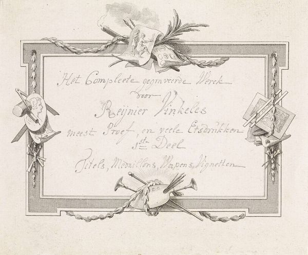
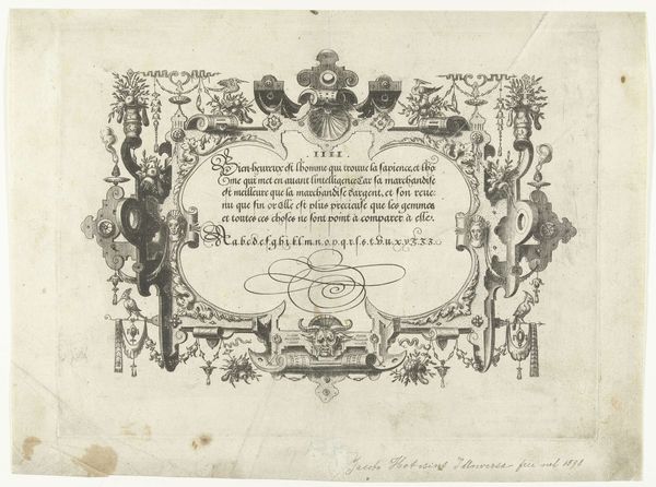
graphic-art, print, typography
#
graphic-art
# print
#
typography
Dimensions: height 111 mm, width 150 mm
Copyright: Rijks Museum: Open Domain
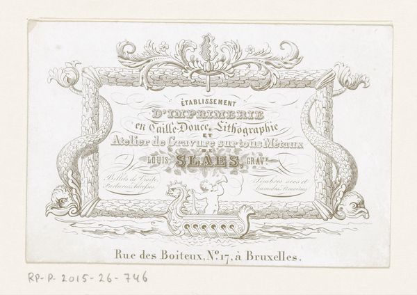
Editor: Here we have a business card from Deveuster Frères, a stationer and office supplier in Brussels, dating from around 1850. It's an example of graphic art and typography, primarily a print. It has an almost overwhelming quality; the layout is intense with many elements crammed into a small area. What strikes you when you look at this? Curator: The density of information certainly creates a visual experience. Let’s consider the framing device, the ornate, almost Rococo border, that attempts to contain the various typographic elements. Note how the typography shifts from a bold, almost declarative typeface for “DEVEUSTER FRÈRES” to a more delicate script for phrases like “Fabrique d’Encre & d'Enveloppes de Lettres.” Observe too, the hierarchy is constructed not just by size, but by contrasting typefaces that create visual interest through variation. How does the interplay of these formal elements guide your eye? Editor: I see how the different fonts create layers, a visual structure beyond just the words. So it's not just *what* they're selling but *how* they're presenting it, like a composition. It's quite clever, using the available space so effectively. Curator: Precisely. Every element – the swirling border, the differing weights of the font, even the strategic placement of phrases like "Rue de l'Hopital" – contributes to a totality, forming a complex relationship within a bounded system of signs. The use of decorative elements isn't mere ornamentation; it’s integral to conveying status and brand. Does that influence how you see the work now? Editor: Yes, now it seems much more intentional. It's not just a business card; it's a carefully constructed visual statement using type and ornamentation as its language. Curator: Indeed. This piece invites us to consider the formal aspects – typography, spatial organization, and ornamentation – and to decipher how they coalesce to deliver its message. Editor: That was insightful. I learned to consider design choices for the sake of both function and communicating status through a business card format.
Comments
No comments
Be the first to comment and join the conversation on the ultimate creative platform.
More like this