#
script typeface
#
sand serif
#
script typography
#
hand drawn type
#
hand-drawn typeface
#
thick font
#
handwritten font
#
golden font
#
classical type
#
historical font
Copyright: Rijks Museum: Open Domain
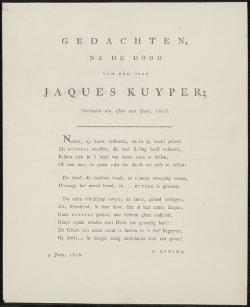
Curator: Looking at this delicate announcement, what feelings rise to the surface for you? Editor: An undeniable solemnity, of course, yet the elegant script almost sings. It’s like a carefully composed poem to mark a departure. There’s beauty even here, you know? Curator: Indeed. What we see is an announcement, "Overlijdensbericht van Jacob Houbraken," which translates to "Death Notice of Jacob Houbraken.” Created sometime after 1800, it resides now within the Rijksmuseum's collection. Consider how mortality and memorialisation have always intertwined with artistic expression. Editor: "Artistic expression," exactly! I was immediately drawn to the font itself, how meticulously it’s been hand-drawn. A stark reminder that even something functional, like an obituary, can possess artistry. Do you think the choice of font says something about Houbraken's stature in society? Curator: Certainly. This announcement's very design speaks to the socio-cultural status accorded to someone of Jacob Houbraken's standing. Remember, death announcements weren't democratized. His name, presented in this way, signals not just an end but also an important life. And perhaps something of a legacy. Editor: I wonder if Houbraken, whoever he was—wait, what did he actually do? Did he like...design fonts, or something? Curator: Actually, Jacob Houbraken was a prominent engraver. Knowing that he, in essence, controlled image production through engraving gives an interesting weight to the art of lettering employed here. Editor: Aha! An engraver of renown meets his final engraving. I’m morbid, I know, but the symbolism’s inescapable. It is the engraver, engraved upon memory. Curator: A fitting image, perhaps. It prompts consideration of how reputations are built and how legacy, particularly for artists, becomes bound to physical forms. This announcement isn't just about loss; it’s about controlling the narrative of remembrance. Editor: You've given me such a different lens! I initially saw it as a somber piece of typography, beautifully rendered. But its ties to societal structure, artistic legacies… That’s made it sing in an unexpected harmony, actually. Curator: Absolutely. I think seeing its place within broader cultural narratives – how social position affects how we mark the passing of notable persons - is insightful and changes its whole essence.
Comments
No comments
Be the first to comment and join the conversation on the ultimate creative platform.
More like this