graphic-art, print, textile, paper, typography
#
portrait
#
graphic-art
# print
#
textile
#
paper
#
typography
#
modernism
Copyright: Rijks Museum: Open Domain
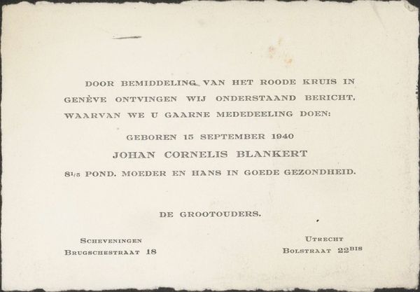
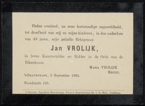
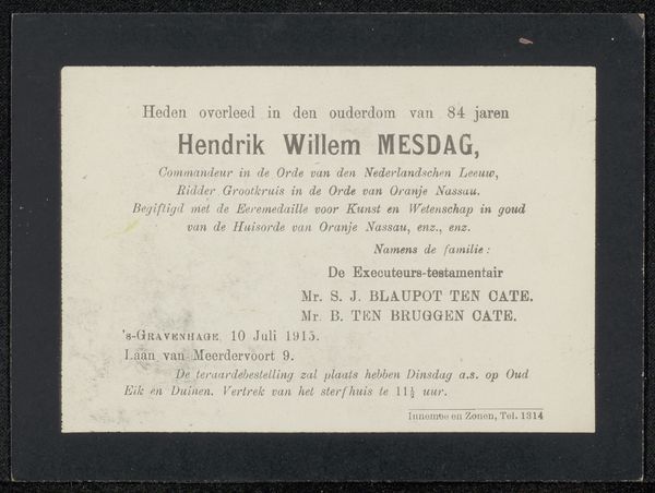
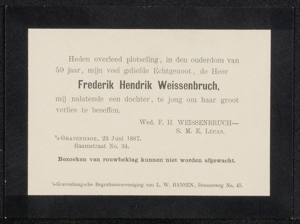
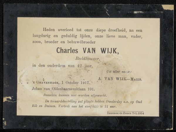
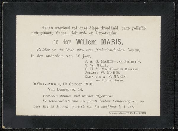
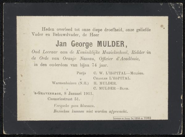
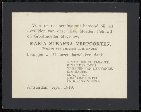
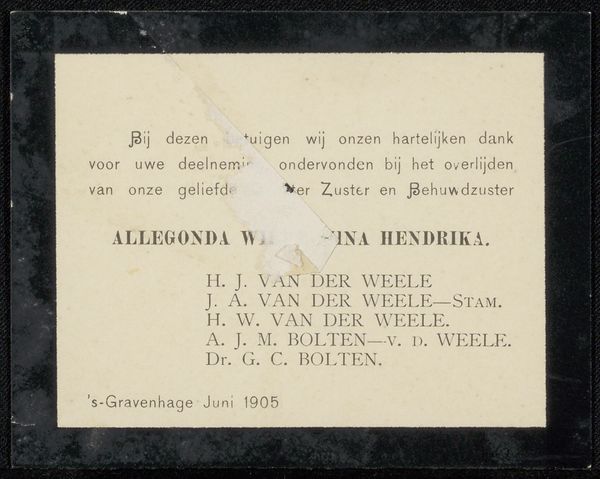
Curator: This piece is entitled "Overlijdensbericht uit archief Philip Zilcken," and dates back to approximately 1910. It’s currently held at the Rijksmuseum. Editor: My initial impression is one of stark simplicity; the high contrast and clear typography certainly command attention. Curator: Indeed. What we have here is more than just graphic art; it’s a death announcement printed on paper, employing typography as its primary medium. Consider the social implications of such a common, yet profoundly intimate, artifact in early 20th century Dutch society. The text provides details of a life, of family relations, of mourning practices. Editor: Absolutely, but I'm also drawn to the structural choices. The arrangement of text creates a visual hierarchy, directing the eye, a sense of somber formality. There’s a delicate balance at play that subtly conveys the gravity of the occasion. Curator: And within that formality is the intensely personal. Look at how the relationships are listed - 'geliefde Echtgenoot, Vader, Behuwd- en Grootvader,' the layers of familial roles are all defined in relation to the deceased, named Dr. Hendrik Jacobus Vinkhuijzen, it encapsulates how he was perceived within his immediate social circles, as opposed to his individual achievements. Editor: The use of typeface itself speaks volumes. Each letter is carefully rendered, contributing to an overall feeling of reverence and measured grief, something we lose with the constant stream of contemporary communication. It really slows you down as a viewer, demanding pause and reflection. Curator: It serves as a potent reminder of mortality, a cultural practice embedded in grief, and offers insight into familial roles of the period. Editor: For me, analyzing the font size, negative space and how those elements contribute to its impact, reveal a fascinating intersection between graphic design and emotional expression. Curator: The way we commemorate, memorialize—it evolves. Yet pieces like this let us reflect on societal values attached to both life and death and how they differ from those of the present day. Editor: In conclusion, the visual grammar it uses quietly underscores our own relationship with loss and the visual language of bereavement.
Comments
No comments
Be the first to comment and join the conversation on the ultimate creative platform.
More like this