print, typography
#
script typeface
#
sand serif
#
script typography
# print
#
old engraving style
#
hand drawn type
#
typography
#
hand-drawn typeface
#
thick font
#
handwritten font
#
golden font
#
historical font
Copyright: Rijks Museum: Open Domain
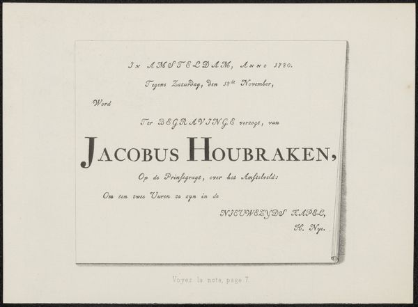
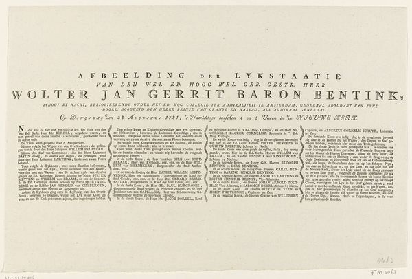
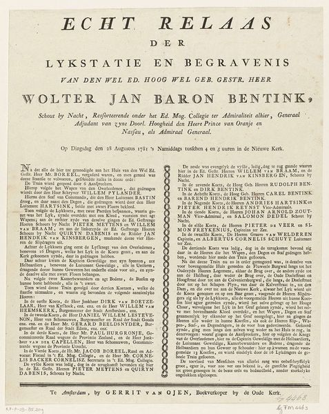
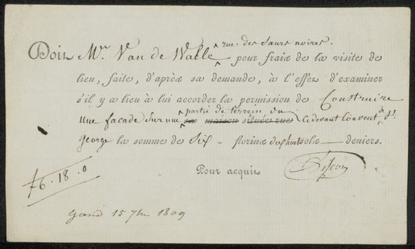
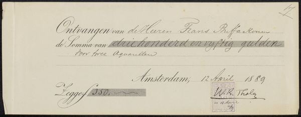
Editor: This is a print titled "Uitnodiging aan Ludolf Backhuysen (II)," created before 1733, currently housed in the Rijksmuseum. What strikes me most is the typography – it’s so meticulously rendered. How do you interpret the formal choices made in its design? Curator: Formally, we see a deliberate contrast between the varying typefaces employed. Note the tension created between the rigidity of the upper text and the almost florid calligraphic signature at the base. The layout, too, exhibits a calculated structure, leading the eye from the date down to the deceased's name. Observe how the artist employs contrasting scales to generate visual hierarchy. Does this directionality strike you as significant? Editor: It does seem deliberate. The artist wants us to know who died and where the service will be held, and in which order. Are the serifs significant to you? Curator: The serifs are undoubtedly integral to its aesthetic character. Their presence contributes to the overall sense of formality and tradition. Each serif, each curve, seems carefully considered. Moreover, examine the spacing between letters and lines; how does this spacing affect the overall legibility and visual rhythm? Editor: Now that you mention it, there's a real rhythm established through the arrangement of text blocks and varying font weights. What is most striking about the forms of the letters? Curator: The meticulousness is really crucial to decode how its constituent parts combine to give the image its appeal. Editor: Thanks! That careful unpacking really helps me understand its formal impact.
Comments
No comments
Be the first to comment and join the conversation on the ultimate creative platform.
More like this