print, typography
#
portrait
#
aged paper
#
script typography
#
ink paper printed
# print
#
old engraving style
#
hand drawn type
#
typography
#
hand-drawn typeface
#
thick font
#
genre-painting
#
golden font
#
realism
#
historical font
#
columned text
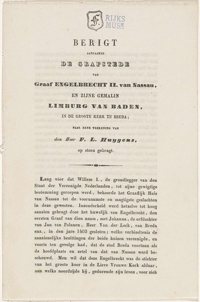
Copyright: Rijks Museum: Open Domain
Editor: This is a print titled "Overlijdensbericht betreffende Gerrit Lamberts," which translates to "Obituary Regarding Gerrit Lamberts." It’s dated to possibly between 1850 and 1854. What strikes me is the starkness of the typography against the aged paper, a visual representation of mortality. What are your immediate observations of this piece? Curator: The arrangement of the typographic elements commands initial attention. Observe the stark contrast in font sizes—"Gerrit Lamberts" dominates the composition. This immediately establishes a hierarchy of importance, guiding the viewer's eye. Consider, too, the negative space. How does the distribution of text within the frame influence your reading of the overall piece? Editor: It makes the words feel heavy, almost like a gravestone inscription. Does the use of typography as a central artistic element say something about the artistic intent itself? Curator: Precisely. The piece reduces pictorial elements to emphasize the formal qualities inherent in typography: line, shape, texture, and contrast. Note the careful spacing between the lines, the subtle shifts in typeface. The artist uses these formal tools to convey meaning and elicit emotion. Editor: It is fascinating to see how the artist conveys information by use of only line, form and font! What have you discovered from taking a formalist approach? Curator: My primary aim has been to underscore how meaning can be derived from a close reading of the work's intrinsic elements, such as composition and font. Examining it apart from any narrative yields new perspectives. Editor: I never would have considered appreciating an obituary through only line and composition, that's quite interesting.
Comments
No comments
Be the first to comment and join the conversation on the ultimate creative platform.
More like this