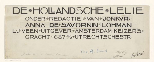
Ontwerp voor een briefhoofd van Motshagens handel in apotheek- en drogisterijbenodigdheden 1884 - 1952
graphic-art, typography, poster
graphic-art
script typography
hand-lettering
small typography
hand drawn type
hand lettering
typography
hand-drawn typeface
fading type
thick font
typography style
poster
small lettering
Dimensions: height 41 mm, width 200 mm
Copyright: Rijks Museum: Open Domain
This "Ontwerp voor een briefhoofd van Motshagens handel in apotheek- en drogisterijbenodigdheden", or design for a letterhead for Motshagen's pharmacy and drugstore supply business, was made by Reinier Willem Petrus de Vries. I see it as a concentrated shot of utilitarian design, squeezed onto a small rectangle. Look closely at how the dense, black typography fights with the limited space, creating a kind of visual tension. The words are so close together that the letters almost blur. There’s a real sense of immediacy here. You can almost feel the designer wrestling with the constraints of the commission, trying to cram as much information as possible into a tiny format. It reminds me of some of Ed Ruscha's word paintings. Both artists share a fascination with the graphic potential of everyday language. This piece is a reminder that art and design are always in conversation, influencing each other in unexpected ways. It’s not about perfection, but about the messy, human process of making something work.
Comments
No comments
Be the first to comment and join the conversation on the ultimate creative platform.