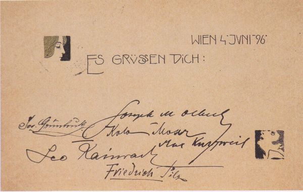
Neufang -Driesen / Familie - Verwandtschaft - Freundschaft / Bilder aus der Jugendzeit, Soldatenzeit, Kriegszeit, Deutschland, Holland, Belgien, Frankreich, Italien, Polen 1940 - 1945
0:00
0:00
drawing, paper
#
script typeface
#
drawing
#
aged paper
#
script typography
#
narrative-art
#
paperlike
#
hand drawn type
#
paper
#
hand-drawn typeface
#
fading type
#
geometric
#
thick font
#
handwritten font
#
academic-art
#
thin font
#
calligraphy
Dimensions: height 180 mm, width 240 mm
Copyright: Rijks Museum: Open Domain
Editor: This piece, made between 1940 and 1945 by Werner Neufang, is a drawing on paper titled "Neufang -Driesen / Familie - Verwandtschaft - Freundschaft / Bilder aus der Jugendzeit, Soldatenzeit, Kriegszeit, Deutschland, Holland, Belgien, Frankreich, Italien, Polen.” The aged paper gives it a strong sense of history, and the text's hand-drawn quality really stands out. How would you interpret this work from a formalist point of view? Curator: Notice first the compositional structure: the hierarchy of the lettering, how the title “Neufang-Driesen” is visually set apart, almost framed. Consider the texture inherent in the aged paper – does its inherent materiality speak to the work’s subject, its temporal anchoring? We must focus on the interplay between these elements and how the artist manipulates the graphic space. The varying styles of script, from the ornate title to the more straightforward listing of countries, suggest a conscious manipulation of form. How do these contrasting forms impact the overall aesthetic effect? Editor: I see what you mean about the script changes creating visual hierarchy. Is the goal to guide the viewer or simply highlight the contrast? Curator: That's the central question for a formalist reading. Disregarding external context, does the contrast enhance the drawing's internal logic? Or does it disrupt its visual unity? We might consider the implied geometry, the implied lines acting almost like architectural plans beneath the text. Look closely at the repeated shapes within each line of script. Can you decode an underlying visual system? Editor: I’m noticing those geometric elements now. The way the curves in “Belgien,” for example, are almost echoed in the border above the title. This has definitely given me a fresh view into how even seemingly simple texts can be complex in design. Curator: Precisely. Through rigorous analysis of form, we unearth layers of artistic intention embedded within even the humblest of materials.
Comments
No comments
Be the first to comment and join the conversation on the ultimate creative platform.
More like this