About this artwork
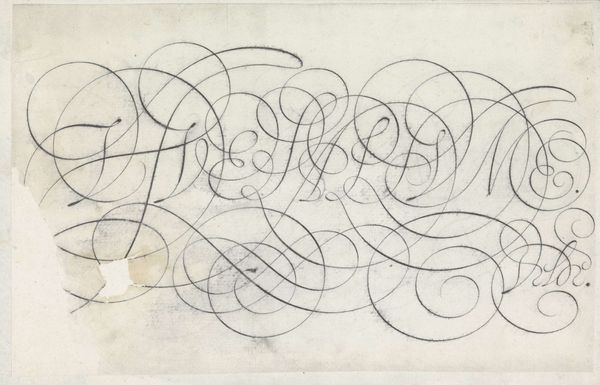
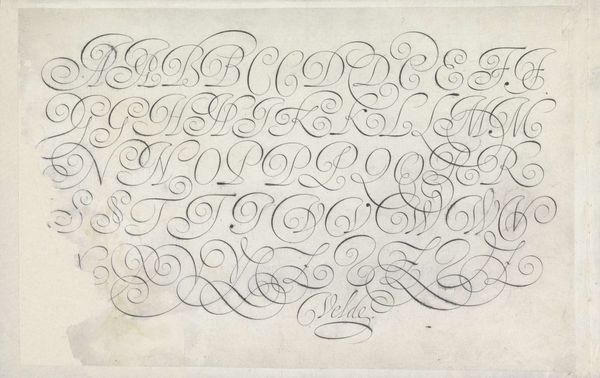
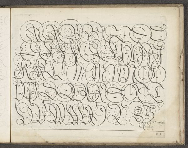
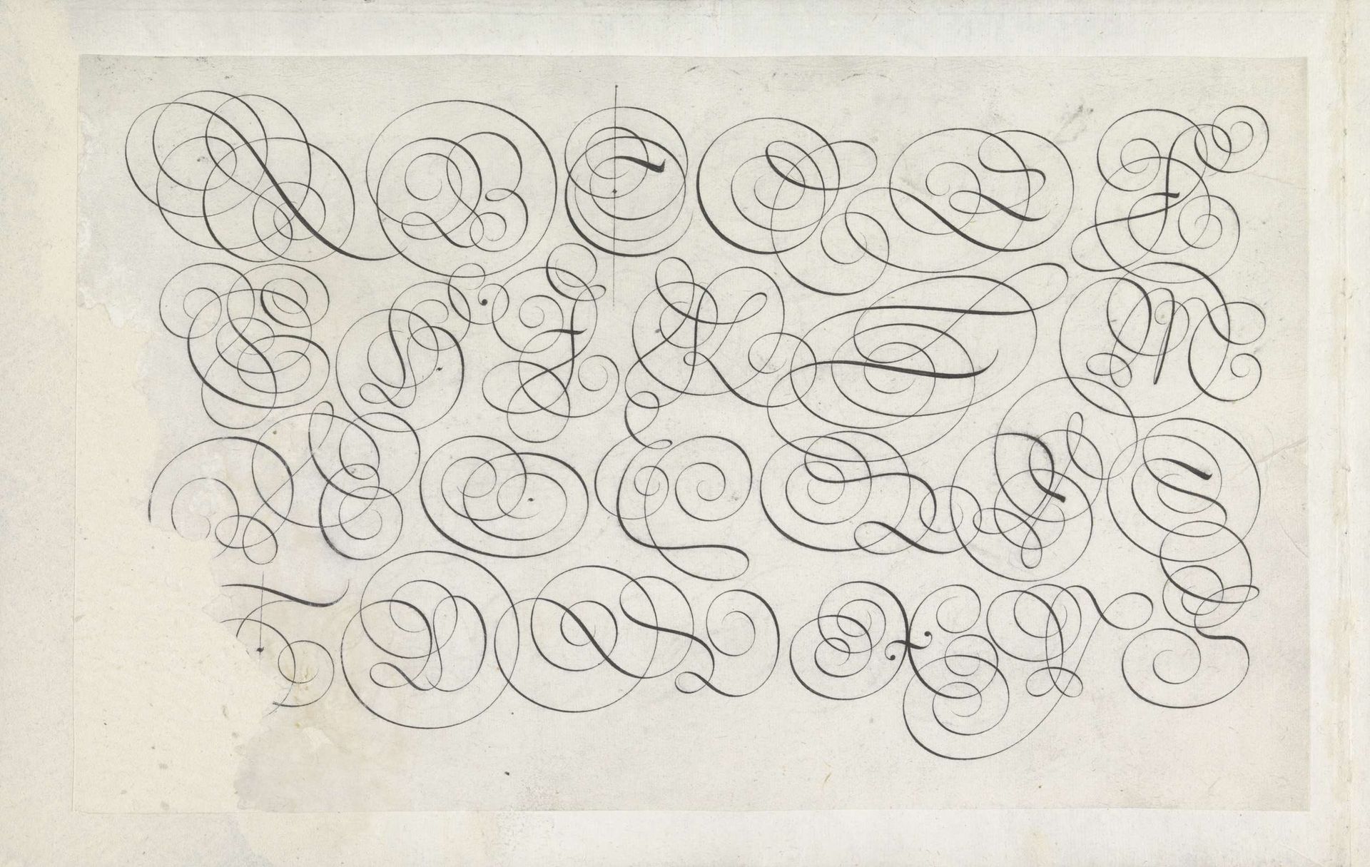
Jan van de Velde I created this alphabet in four lines of capital letters. Note the elaborate swirls and flourishes characteristic of early modern calligraphy. These embellished letters are not merely ornamental. The act of writing, especially in such a stylized manner, was seen as an expression of the self. Each curve and loop embodies the writer's unique spirit. Consider the 'S,' reminiscent of a serpent, a symbol laden with meaning across cultures. In some contexts, it represents wisdom and healing, as seen in the caduceus. Yet, it also evokes temptation and chaos, echoing the biblical serpent in Eden. This duality reminds us that symbols are never fixed; they evolve, accumulating layers of meaning as they journey through time. Such calligraphy invites us to delve into our collective memory, a visual language that resonates on a subconscious level. Notice the emotional power, how it transcends mere communication and engages us on a deeper level. It reflects the cyclical nature of symbols, constantly resurfacing, transformed yet still connected to their origins.
Ontwerp van een schrijfvoorbeeld: het alfabet in vier regels kapitalen 1605
Jan van de Velde I
1568 - 1623Location
RijksmuseumArtwork details
- Medium
- drawing, paper, typography, ink
- Dimensions
- height 186 mm, width 304 mm
- Location
- Rijksmuseum
- Copyright
- Rijks Museum: Open Domain
Tags
drawing
hand-lettering
dutch-golden-age
lettering
hand drawn type
typography
hand lettering
paper
word art
typography
ink
hand-drawn typeface
calligraphic
typography style
decorative-art
calligraphy
small lettering
Comments
No comments
About this artwork
Jan van de Velde I created this alphabet in four lines of capital letters. Note the elaborate swirls and flourishes characteristic of early modern calligraphy. These embellished letters are not merely ornamental. The act of writing, especially in such a stylized manner, was seen as an expression of the self. Each curve and loop embodies the writer's unique spirit. Consider the 'S,' reminiscent of a serpent, a symbol laden with meaning across cultures. In some contexts, it represents wisdom and healing, as seen in the caduceus. Yet, it also evokes temptation and chaos, echoing the biblical serpent in Eden. This duality reminds us that symbols are never fixed; they evolve, accumulating layers of meaning as they journey through time. Such calligraphy invites us to delve into our collective memory, a visual language that resonates on a subconscious level. Notice the emotional power, how it transcends mere communication and engages us on a deeper level. It reflects the cyclical nature of symbols, constantly resurfacing, transformed yet still connected to their origins.
Comments
No comments