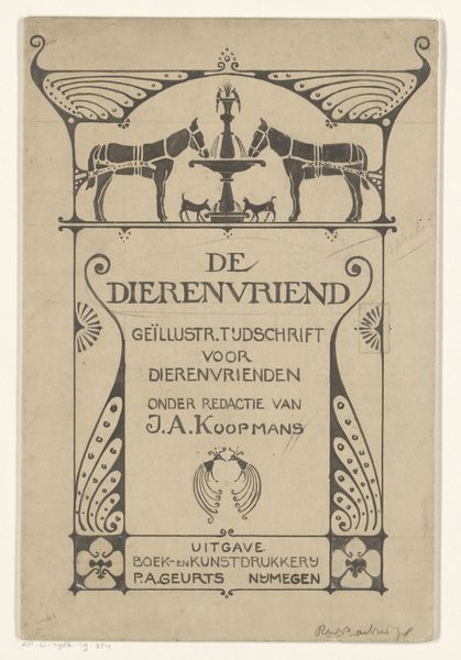
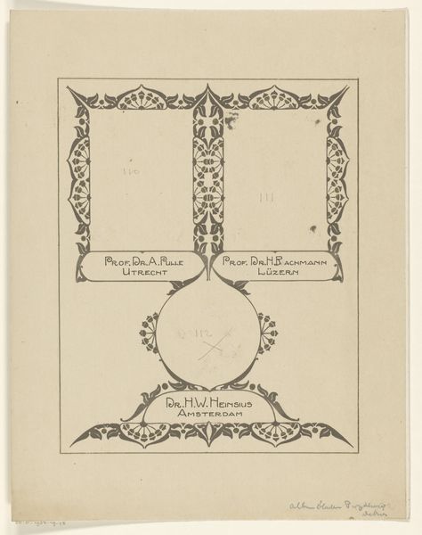
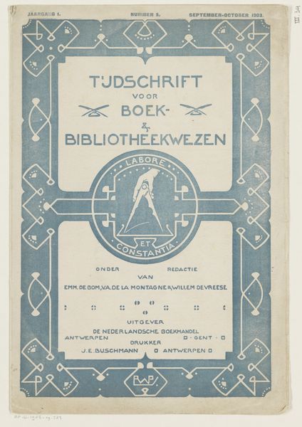
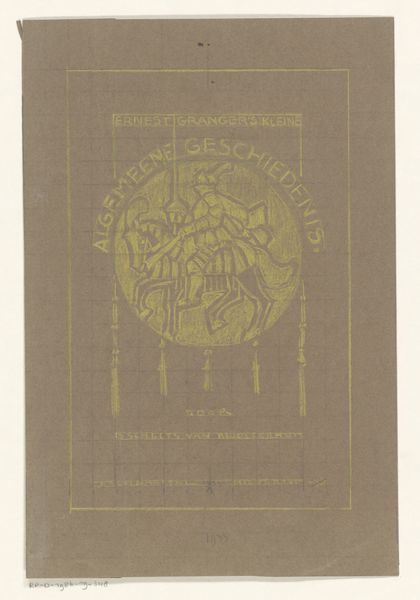
Omslagontwerp voor: Vademecum. Praktische 10 cents bibliotheek, 1903 1903
drawing, graphic-art, typography, poster
photo of handprinted image
drawing
graphic-art
type repetition
aged paper
toned paper
art-nouveau
old engraving style
hand drawn type
personal sketchbook
typography
ink colored
line
decorative-art
poster
colour shading
columned text
Dimensions: height 199 mm, width 134 mm
Copyright: Rijks Museum: Open Domain
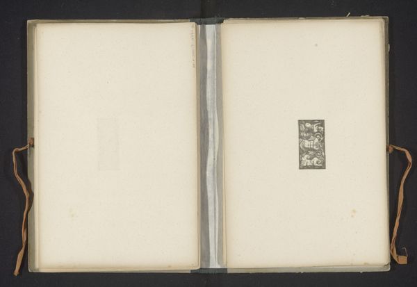
Curator: This piece grabs me right away. It has that unfinished, striving-for-perfection aura that pulls me in. Like eavesdropping on an artist’s most private moment. Editor: Indeed. What you're seeing is Reinier Willem Petrus de Vries’s cover design for “Vademecum. Practical 10 Cents Library” from 1903. It is an example of the commercial art that was really taking off at that moment in time. Curator: 10 cents! Imagine. It's beautiful, the hand-drawn typography just sings, and the art nouveau swirls add a touch of whimsy. Is it just me, or does it also seem oddly… calculated? Like a beautiful cage almost. Editor: That's interesting, given the socio-economic context. In the late 19th and early 20th centuries, you have figures like William Morris reacting to industrialization by advocating for beautiful, handcrafted objects for all. De Vries seems to be playing with similar ideas. Curator: Absolutely. Even though it's "just" a book cover, there's a definite commentary. I almost get a spiritual reading of this image with how it presents and obscures access to knowledge. It feels like an almost holy ritual being depicted. Am I stretching things too far here? Editor: Not at all. Art Nouveau aimed to elevate everyday objects, infusing them with artistic value and meaning for broader societal enrichment. The title itself, “Vademecum,” implying something indispensable or frequently consulted, speaks to making knowledge more accessible. Curator: Then, the grid showing through the design, it adds an intellectual yet unfinished feel, and makes me believe this book could potentially change you and your outlook. Editor: And its unfinished feel, exposing its construction, hints at the labor involved in making information readily available. Perhaps its unfinished design challenges that easy accessibility. Curator: Fascinating. What starts as a simple book cover morphs into a real statement on information, cost, and aspiration. Art is truly the great magician, isn’t it? Editor: Absolutely, offering us a window into the hopes, anxieties, and aspirations of a society undergoing transformation. Looking closely, that initial sketch reveals so much more than meets the eye.
Comments
No comments
Be the first to comment and join the conversation on the ultimate creative platform.
More like this