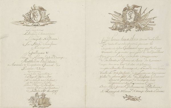
print, typography
#
script typeface
#
neoclacissism
#
aged paper
#
script typography
#
parchment
# print
#
old engraving style
#
hand drawn type
#
personal sketchbook
#
typography
#
golden font
#
word imagery
#
historical font
Dimensions: height 241 mm, width 153 mm
Copyright: Rijks Museum: Open Domain
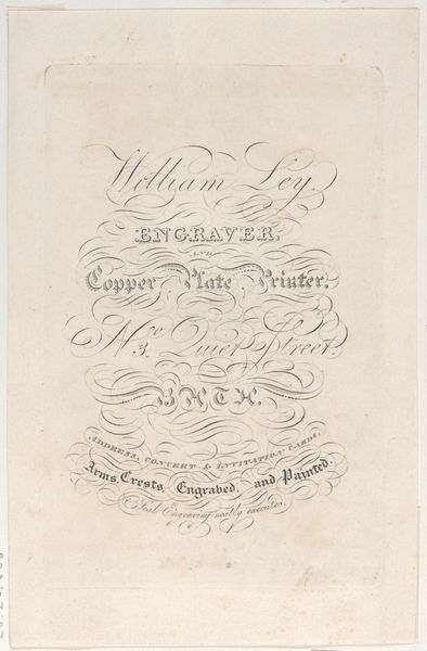
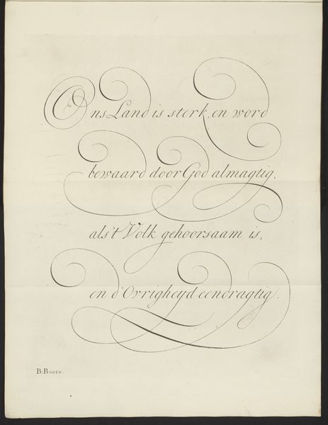
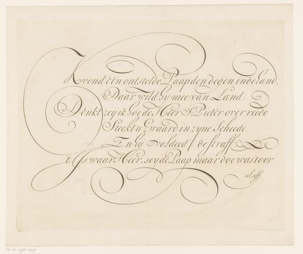
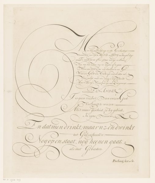
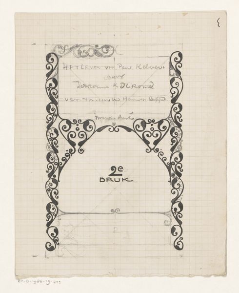
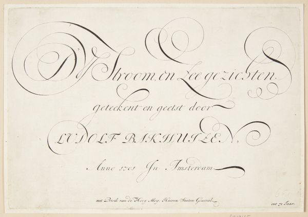
Editor: So, this is the title page for T.S. Surr's "De Tooverkracht des Rijkdoms," or "The Magic of Wealth," from 1816. It's a print. I'm struck by how much the typography feels like an elaborate drawing in itself. How would you approach interpreting this? Curator: Well, initially I'm drawn to the line work. Observe how the calligraphic flourishes aren't mere decoration, but build the composition. The curves create a sense of movement, almost a dance across the page. Note how the arrangement guides the eye, directing it downwards through a hierarchy of textual information. Consider the contrast of delicate strokes and bolder lettering, too; what sort of relationship does that establish, aesthetically? Editor: That’s a great point! I see that now – it's not just information, it’s a very deliberate visual structure. So, are you saying the forms themselves communicate something beyond the literal meaning of the words? Curator: Precisely. Disregard the textual meaning for a moment, and appreciate the pure abstract relationships created through line, shape, and space. Semiotically, even the "aged paper" adds to the character of the print: the imperfections on the parchment create contrast. This creates meaning too, wouldn’t you agree? Editor: Absolutely, it brings a whole different dimension to the work and highlights the relationship between form and content in this example. I never considered how deeply those elements play into the overall message! Curator: Indeed, analyzing typography this way illuminates its potential as an artistic language that conveys meaning and evokes mood and thought beyond words alone.
Comments
No comments
Be the first to comment and join the conversation on the ultimate creative platform.
More like this