About this artwork
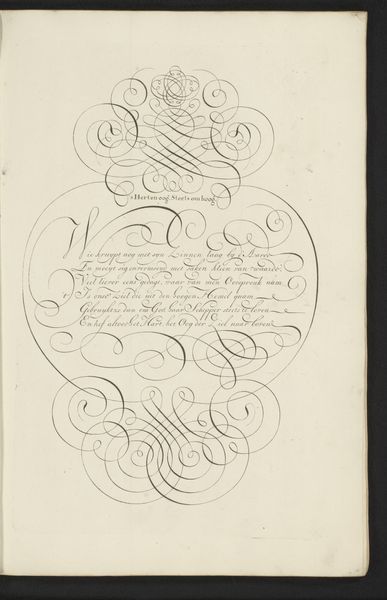
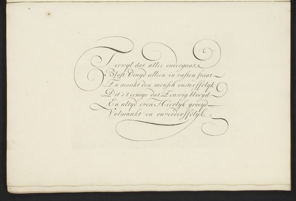
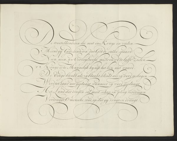
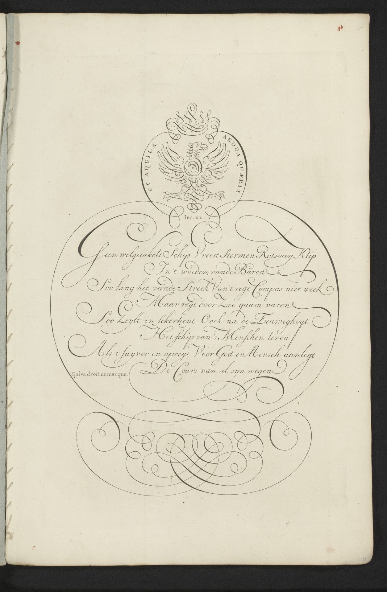
Curator: This pen and ink drawing from between 1660 and 1751, titled "Schrijfvoorbeeld: Geen welgetakelt Schip (...)" showcases intricate calligraphy on paper by Bastiaan Boers. Editor: Immediately striking. The lettering itself has a weight, a presence; you can practically feel the hand that created these fluid strokes. What about its purpose? Curator: It seems to be a writing sample, likely from a personal sketchbook, revealing Boers' mastery of lettering. The flourishes suggest a Baroque influence, common in that era for emphasizing skill and ornamentation. Editor: Absolutely. We're seeing a performance of skill here, and a presentation of Dutch artistry, I wonder who Boers intended as an audience? A student? Patron? A potential buyer of his calligraphic prowess? It appears to speak to navigation; a "ship that fears no storms", which feels linked to Dutch trade and naval power at the time. Curator: Precisely! The repetition of forms within the lettering emphasizes its design-like aspect, while the religious undertones point to a connection with a patron or institution where values of skill and religious practice intertwine. This interplay suggests a merging of craft and social expectations. Editor: This reminds me that we tend to value ‘original’ art from this time period. What are we to make of art that is ‘sample’ for commercial activity? Is the act of skill and practice somehow absent of artistry? Does the ‘means of production’ rob us of our own meaning making in return? Curator: An interesting point. Considering the value placed on fine script during the 17th and 18th centuries, this piece offers a window into that appreciation and invites us to consider how skills, especially those closely linked to textual dissemination, held sway in society and are also an enduring record to craftsmanship Editor: Indeed, examining a piece like this illuminates the social history behind everyday skill and their own forms of unique material creation that remains potent for analysis today. Curator: Absolutely, there is lasting artistry in his mark making as well.
Artwork details
- Medium
- drawing, graphic-art, paper, ink
- Dimensions
- height 315 mm, width 204 mm
- Copyright
- Rijks Museum: Open Domain
Tags
Comments
Share your thoughts
About this artwork
Curator: This pen and ink drawing from between 1660 and 1751, titled "Schrijfvoorbeeld: Geen welgetakelt Schip (...)" showcases intricate calligraphy on paper by Bastiaan Boers. Editor: Immediately striking. The lettering itself has a weight, a presence; you can practically feel the hand that created these fluid strokes. What about its purpose? Curator: It seems to be a writing sample, likely from a personal sketchbook, revealing Boers' mastery of lettering. The flourishes suggest a Baroque influence, common in that era for emphasizing skill and ornamentation. Editor: Absolutely. We're seeing a performance of skill here, and a presentation of Dutch artistry, I wonder who Boers intended as an audience? A student? Patron? A potential buyer of his calligraphic prowess? It appears to speak to navigation; a "ship that fears no storms", which feels linked to Dutch trade and naval power at the time. Curator: Precisely! The repetition of forms within the lettering emphasizes its design-like aspect, while the religious undertones point to a connection with a patron or institution where values of skill and religious practice intertwine. This interplay suggests a merging of craft and social expectations. Editor: This reminds me that we tend to value ‘original’ art from this time period. What are we to make of art that is ‘sample’ for commercial activity? Is the act of skill and practice somehow absent of artistry? Does the ‘means of production’ rob us of our own meaning making in return? Curator: An interesting point. Considering the value placed on fine script during the 17th and 18th centuries, this piece offers a window into that appreciation and invites us to consider how skills, especially those closely linked to textual dissemination, held sway in society and are also an enduring record to craftsmanship Editor: Indeed, examining a piece like this illuminates the social history behind everyday skill and their own forms of unique material creation that remains potent for analysis today. Curator: Absolutely, there is lasting artistry in his mark making as well.
Comments
Share your thoughts