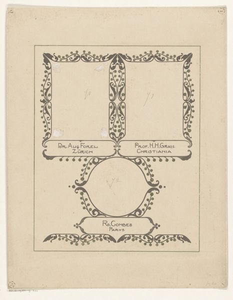
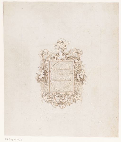
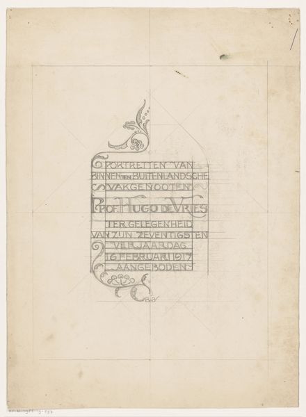
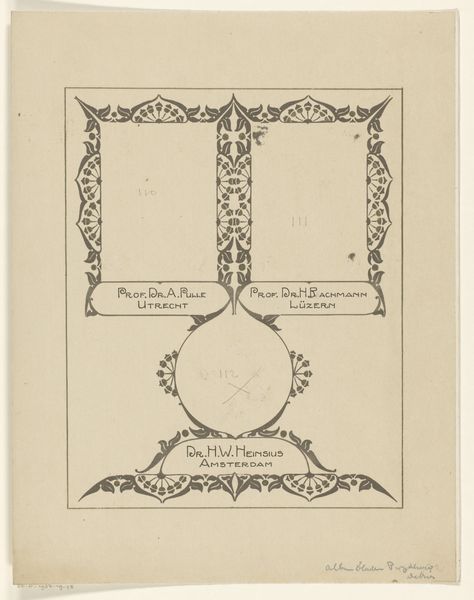
Bandontwerp voor: Jerome K. Jerome, Het leven van Paul Kelver, c. 1923 before 1923
0:00
0:00
Dimensions: height 190 mm, width 153 mm
Copyright: Rijks Museum: Open Domain
Editor: This is a fascinating book cover design for "Het leven van Paul Kelver" by Jerome K. Jerome, created around 1923 by Reinier Willem Petrus de Vries. It’s primarily a pen and ink drawing with some pencil under-drawings on graph paper, and there’s something so charming about its handcrafted quality. I am curious about what strikes you first when you examine this piece. Curator: Immediately, the interplay between the organic and the geometric commands attention. Observe how the artist marries the fluidity of Art Nouveau, particularly evident in the curvilinear motifs flanking the text, with the structured grid of the underlying paper. Do you see how the controlled chaos of the decorative elements interacts with the implied structure? Editor: I do. It’s almost like a dance between freedom and constraint. The typography also stands out – the lettering is stylized but still very legible. Curator: Precisely. The typography here functions not merely as text but as an integral compositional element. Note the spatial relationships between the lettering and the surrounding ornamentation. Ask yourself how these visual rhythms contribute to the overall harmony or disharmony of the piece. Consider, too, the use of negative space – its role in defining forms and creating visual interest. What effect is created? Editor: It prevents the design from becoming too overwhelming. It helps balance everything, drawing attention to particular areas, while helping the eye to move around the frame. It makes me consider the role of book design. Curator: Indeed. Considering all of these formal relationships helps us come to understand that the book cover's intention and functionality are integral parts of its art. The line qualities add depth and richness that makes it so engaging to explore. Editor: I now notice so much that I missed initially, appreciating the contrast and relationship of the structural choices. Thank you for that. Curator: It is the close reading of form that unlocks deeper appreciation.
Comments
No comments
Be the first to comment and join the conversation on the ultimate creative platform.
More like this