#
sand serif
#
script typography
#
hand-lettering
#
hand drawn type
#
hand lettering
#
hand-drawn typeface
#
thick font
#
handwritten font
#
golden font
#
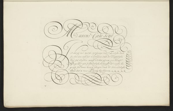
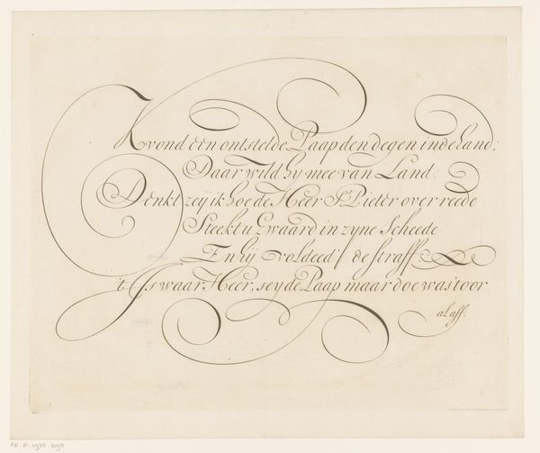
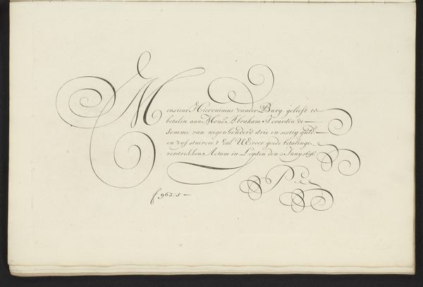
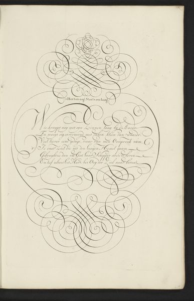
calligraphy
#
small lettering
Dimensions: height 415 mm, width 320 mm
Copyright: Rijks Museum: Open Domain
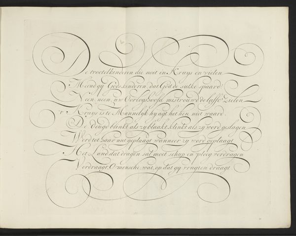
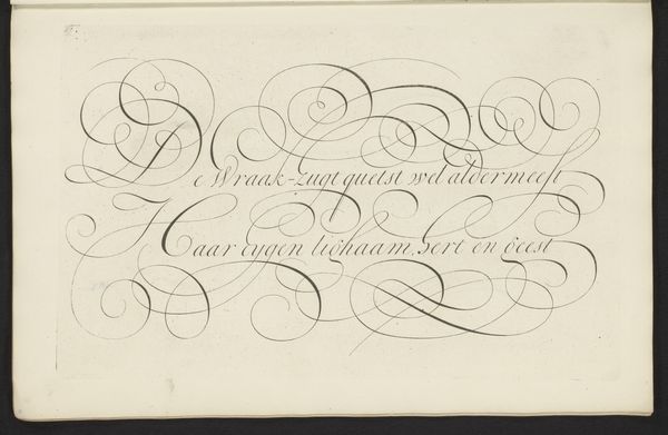
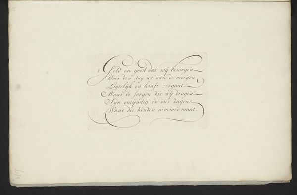
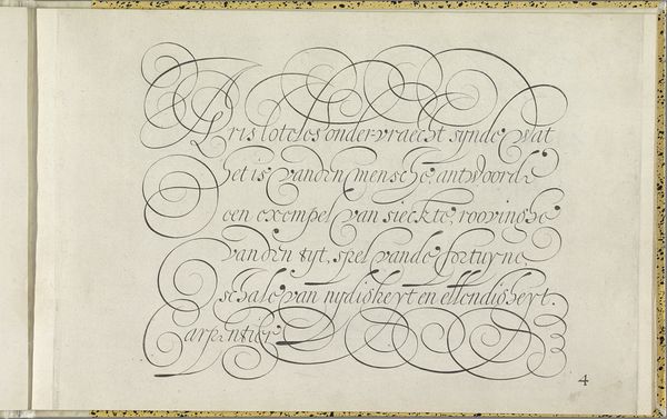
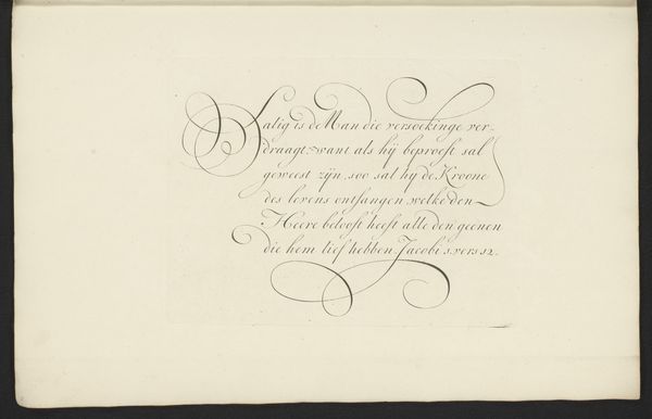
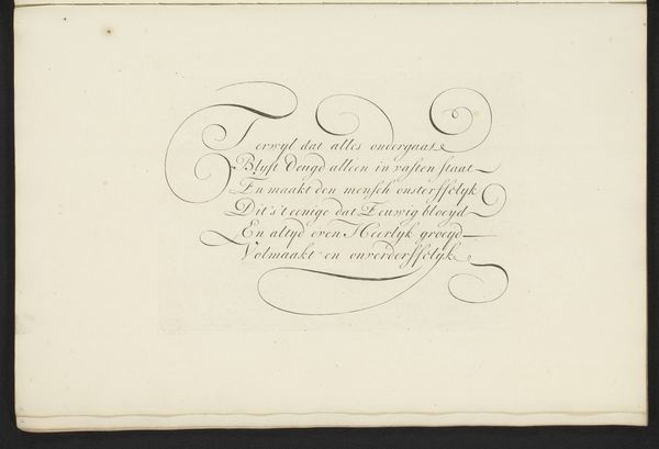
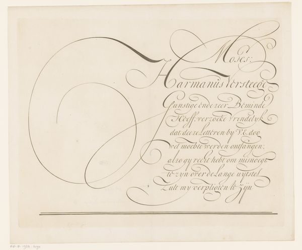
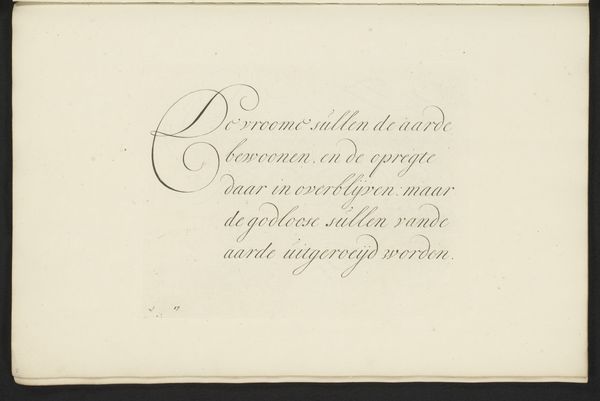
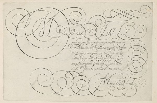
Curator: The work before us is entitled "Schrijfvoorbeeld: Ons Land is sterk (...)," created sometime between 1660 and 1713 by Bastiaan Boers. It appears to be a calligraphic sample. Editor: My first impression is of flowing elegance. The letterforms dance across the page, almost as if they’re unbound by gravity. It's visually pleasing with the balanced, airy composition and generous spacing between the lines. Curator: Indeed. The piece demonstrates incredible control of line and form. Observe the serifs; their curves, like pure geometry, are self-referential but are obviously evocative of the sentiment, echoing and emphasizing particular semantic moments. Notice, also, how the interplay between the thicker and thinner strokes gives it a unique visual rhythm, almost like musical notation on paper. Editor: Absolutely, it showcases craft skill, doesn’t it? I imagine this was created with a quill, with its ink residue suggesting materiality and texture, perhaps. And, given the likely social context of 17th-century Europe, was this type of skill particularly valuable for bureaucratic or administrative tasks? Who was able to engage in creating pieces such as this at that time? Curator: Precisely, the societal impact cannot be overlooked. One can view this from multiple interpretive layers. Semiotically, these are signs—language—meant for communication and interpretation. Beyond the beauty, what message is conveyed, how does the structure affect its ability to impact the viewer, and how are power relations inscribed? Editor: A very political position to make it a text in copperplate script. It feels powerful for the period when national identities were actively being forged. A statement of cultural identity through refined manual execution! Curator: Indeed, a complex synthesis! Through rigorous consideration of its form and purpose, it enables us to see lettering in both structural and expressive modes of meaning. Editor: Yes, the materials are humble, paper and ink, yet elevated by the intense labor and refined hand involved in production. Curator: It gives one much to consider regarding writing as image, idea, and artifact. Editor: Indeed; I found that an enriching experience!
Comments
No comments
Be the first to comment and join the conversation on the ultimate creative platform.
More like this