About this artwork
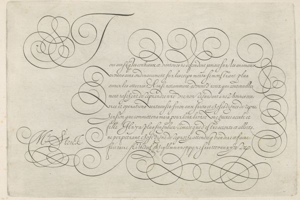
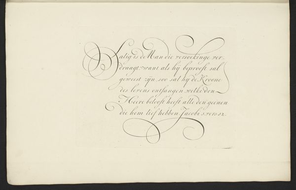
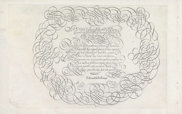
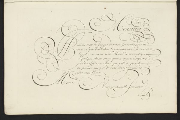
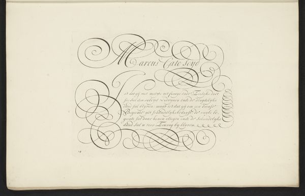
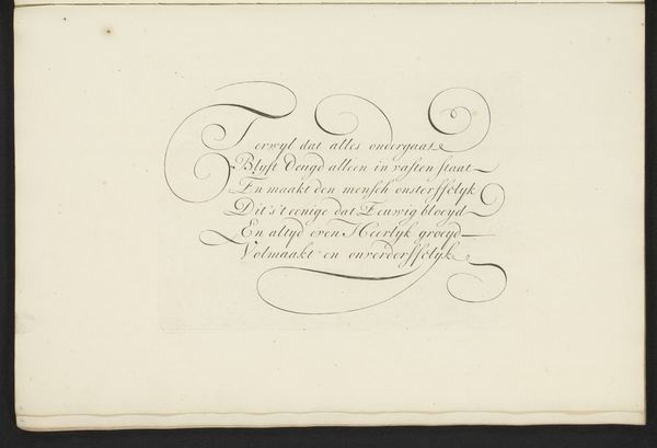
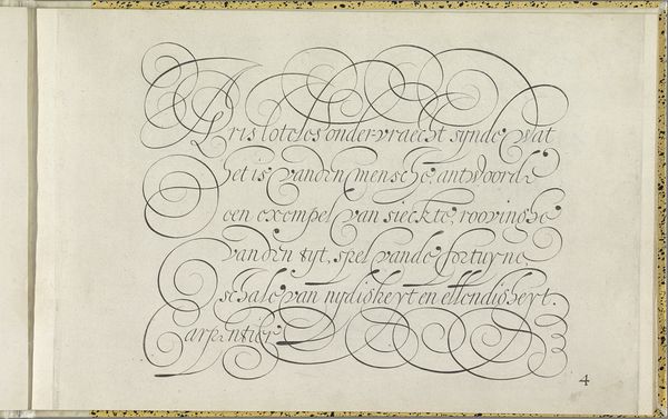
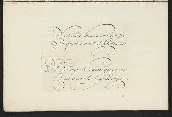
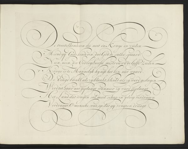
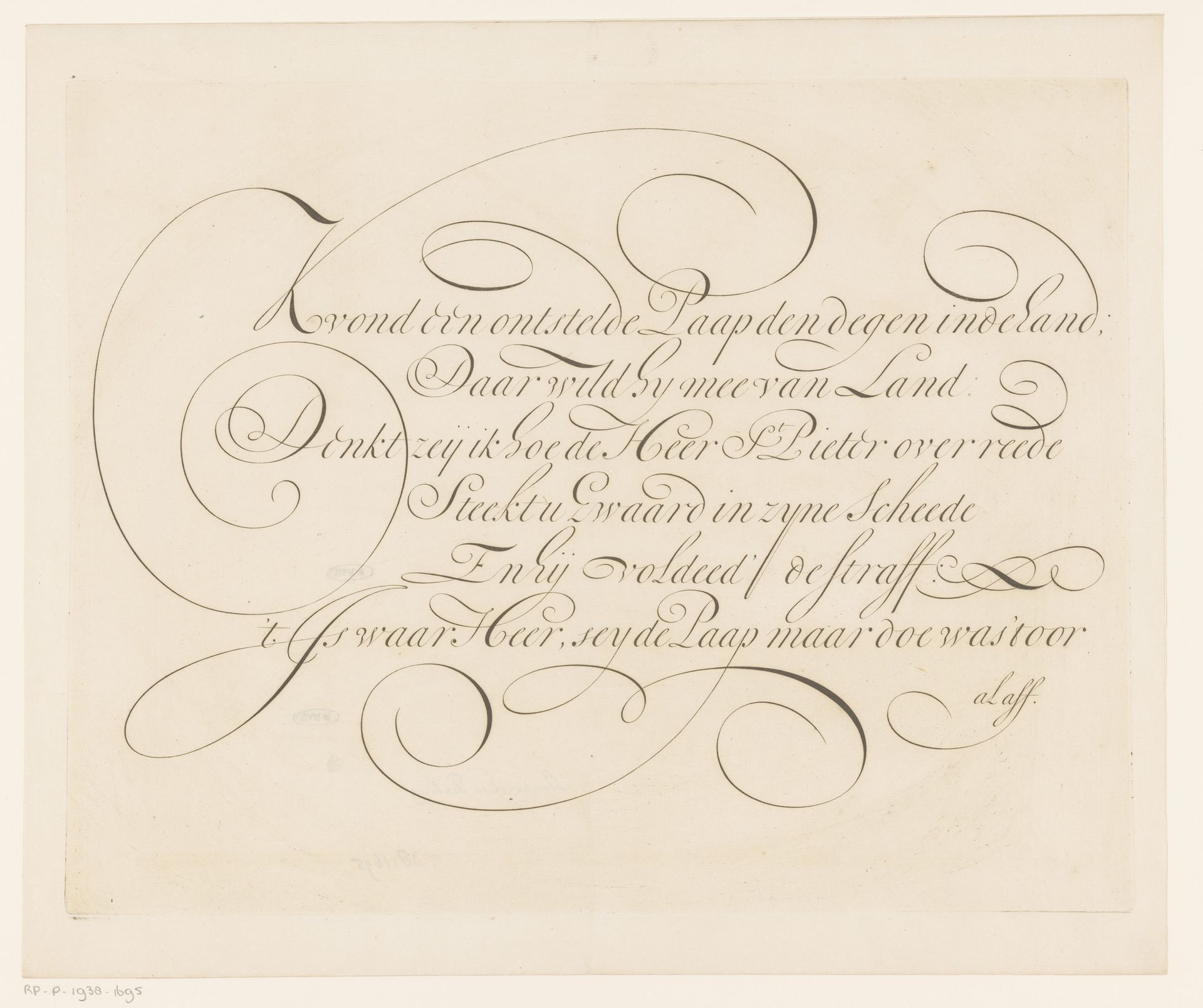
Curator: I find this piece just radiates elegance, like a carefully penned letter sealed with wax, holding secrets only those who truly pay attention can decipher. Editor: Indeed. What strikes me initially is the curvilinear quality of the calligraphy. Ambrosius Perling's "Schrijfvoorbeeld: Kvond een ontstelde Paap (...)", created between 1667 and 1718 using ink on paper, exemplifies baroque calligraphy's emphasis on elaborate form. The work feels balanced by its heavy swirls, like counterweights pulling each other toward an internal harmony. Curator: Harmony is exactly what it feels like! I could stare at the letterforms forever, I can almost feel the writer lost in a beautiful daze, pouring out feelings onto parchment... I can smell the ink from here! Editor: Focusing on those letterforms: note how Perling employs thick and thin strokes, lending dynamism. Observe, too, the generous loops and flourishes, which simultaneously guide the eye and ornament the textual content. Curator: You are right about it "guiding the eye", this thing is carefully constructed and has clearly undergone iteration after iteration before feeling right. Tell me more about that Baroque sensibility in the piece, which is what I would expect based on the timeframe. Editor: Certainly. During the Baroque period, there was a focus on ornateness and complexity in art as well as, here, script. Think of it as an assertion of skill: calligraphy transformed from mere writing into high art through sheer virtuosity. It's visual theater. Curator: "Visual theater," exactly. Each curl is a tiny performance! For me, there is a dance with precision meeting abandon. In these flourishes, and the darkness of ink on paper, lies pure artistry, a rebellion against stark practicality. Editor: On reflection, I find the dialogue between rigidity of structure and that flamboyant expression unexpectedly moving. Curator: Precisely. A disciplined release. It whispers to us about an earlier period when calligraphy wasn't only a record, but an experience. A beautiful one at that!
Artwork details
- Medium
- drawing, print, paper, ink
- Dimensions
- height 321 mm, width 410 mm
- Copyright
- Rijks Museum: Open Domain
Tags
Comments
Share your thoughts
About this artwork
Curator: I find this piece just radiates elegance, like a carefully penned letter sealed with wax, holding secrets only those who truly pay attention can decipher. Editor: Indeed. What strikes me initially is the curvilinear quality of the calligraphy. Ambrosius Perling's "Schrijfvoorbeeld: Kvond een ontstelde Paap (...)", created between 1667 and 1718 using ink on paper, exemplifies baroque calligraphy's emphasis on elaborate form. The work feels balanced by its heavy swirls, like counterweights pulling each other toward an internal harmony. Curator: Harmony is exactly what it feels like! I could stare at the letterforms forever, I can almost feel the writer lost in a beautiful daze, pouring out feelings onto parchment... I can smell the ink from here! Editor: Focusing on those letterforms: note how Perling employs thick and thin strokes, lending dynamism. Observe, too, the generous loops and flourishes, which simultaneously guide the eye and ornament the textual content. Curator: You are right about it "guiding the eye", this thing is carefully constructed and has clearly undergone iteration after iteration before feeling right. Tell me more about that Baroque sensibility in the piece, which is what I would expect based on the timeframe. Editor: Certainly. During the Baroque period, there was a focus on ornateness and complexity in art as well as, here, script. Think of it as an assertion of skill: calligraphy transformed from mere writing into high art through sheer virtuosity. It's visual theater. Curator: "Visual theater," exactly. Each curl is a tiny performance! For me, there is a dance with precision meeting abandon. In these flourishes, and the darkness of ink on paper, lies pure artistry, a rebellion against stark practicality. Editor: On reflection, I find the dialogue between rigidity of structure and that flamboyant expression unexpectedly moving. Curator: Precisely. A disciplined release. It whispers to us about an earlier period when calligraphy wasn't only a record, but an experience. A beautiful one at that!
Comments
Share your thoughts