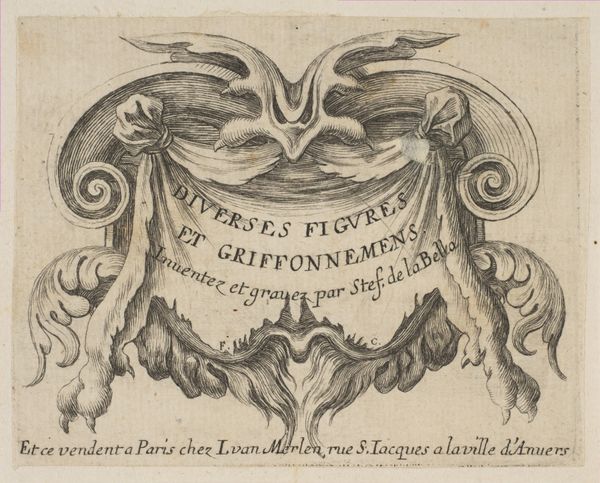
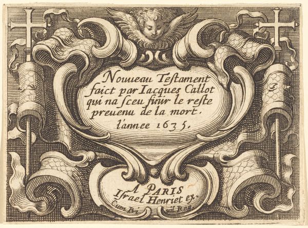
Titelprent met cartouche met tekst en twee bazuinblazende engelen 1620 - 1664
0:00
0:00
stefanodellabella
Rijksmuseum
drawing, print, intaglio, ink, engraving
#
drawing
#
hand-lettering
#
baroque
# print
#
pen sketch
#
intaglio
#
old engraving style
#
hand drawn type
#
personal sketchbook
#
ink
#
hand-drawn typeface
#
pen-ink sketch
#
line
#
pen work
#
sketchbook drawing
#
sketchbook art
#
engraving
Dimensions: height 54 mm, width 84 mm
Copyright: Rijks Museum: Open Domain
Editor: This is the "Titelprent met cartouche met tekst en twee bazuinblazende engelen," or title print with cartouche, text and two trumpet-blowing angels, created between 1620 and 1664 by Stefano della Bella. It's an engraving. The detail achieved through the intaglio printmaking technique is quite striking. What particularly stands out to you about its formal elements? Curator: Formally, one immediately notices the carefully balanced composition. The symmetrical arrangement, with two angels flanking a central cartouche and crowned shield, demonstrates a sophisticated understanding of visual harmony. The artist’s linework also compels close inspection; see how varied pressure creates depth and textural differentiation. Notice the contrast between the crisp lines of the lettering and the softer, more modulated shading of the drapery. What purpose do you believe these elements serve in conveying meaning or intent? Editor: It's true that I am struck by the fine details, particularly of the drapery. The crispness does seem like an intentional decision on the artist’s part. How do these design elements come together to suggest a more general meaning, would you say? Curator: In analysing this design we might note the effective organisation of planar depth despite an essentially linear mode of presentation. One may further consider how this approach relates to that seen within contemporary graphic arts of this era. Consider the density of lines and their relationship with values, forms, and visual weight; the combination of elements makes a strong compositional statement. Editor: So, a tight structure is essential, here. I hadn't noticed how controlled the line variations were, making different kinds of forms come forward or recede. Curator: Exactly. Attending to the intrinsic features unveils underlying formal mechanics that have guided interpretation through art history. What began as illustration ends as powerful abstract exercise. Editor: Seeing your analytical interpretation gives me fresh perspective on such graphic works of the period. I'm inspired to go look at some of the other pieces around here from a new formalist direction.
Comments
No comments
Be the first to comment and join the conversation on the ultimate creative platform.
More like this