drawing, graphic-art, print
#
drawing
#
graphic-art
#
aged paper
#
toned paper
# print
#
sketch book
#
personal sketchbook
#
sketchwork
#
folk-art
#
pen and pencil
#
pen work
#
sketchbook drawing
#
cityscape
#
storyboard and sketchbook work
#
sketchbook art
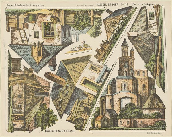
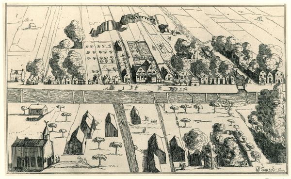
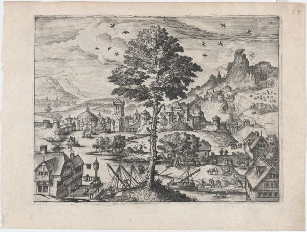
Dimensions: height 342 mm, width 423 mm
Copyright: Rijks Museum: Open Domain
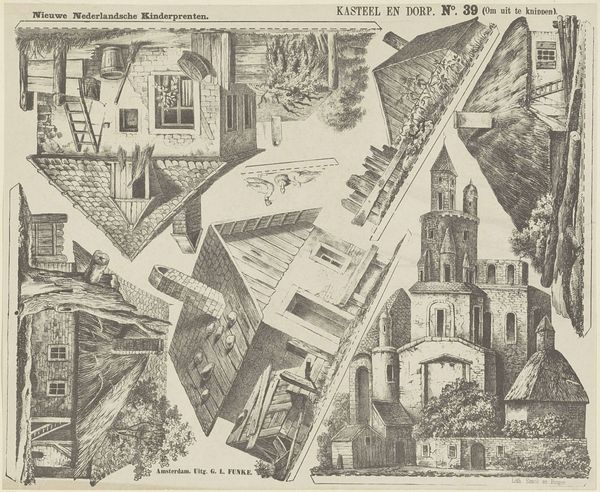
Curator: The work we're looking at is "Kasteel en dorp" by George Lodewijk Funke, dating from between 1865 and 1875. It appears to be a drawing intended for graphic reproduction, maybe a print from a sketchbook. My initial impression is… whimsical! A scattered puzzle of buildings. Editor: I see what you mean. At first glance, it does feel somewhat childlike and scattered. The subdued color palette gives it an antiquated feeling; one has a sense that the very support upon which the image resides has considerable age and is near disintegrating! Curator: Exactly! It’s actually intended as a children’s print. Looking closer, you'll see the directive written above the title to ‘cut out’—indicating this was likely a template meant to be disassembled and refigured, perhaps for a game. It offers an interesting insight into the leisure activities marketed toward children. I wonder about the labor involved in creating these kinds of images. Editor: Well, let's consider the image itself. Each architectural component--roof, wall, window--possesses a clear contour line. I suspect this structural exactitude served didactic needs, a means of clarifying discrete forms. A child must, in turn, adopt a certain technical precision, engaging and grappling with form as construction. Curator: And what does it mean that it depicts, ostensibly, folk art? This idea of vernacular structures became more fashionable at this moment. Consider, for example, the aesthetic investments in images of cottages and rural idyll. Funke's print underscores emerging bourgeois and mercantile desires at midcentury! It asks us to think through modes of visual consumption through playful interaction. Editor: Precisely. One encounters at first something almost deconstructivist with Funke. But as we analyze the architectural lines themselves, we witness an adherence to form. Through precise design, it attempts to reveal and define architectural structures! Curator: I see that now too. What appeared initially like arbitrary elements assemble together, producing a kind of built environment within a very specific period of the Dutch cultural market. Editor: It's quite striking how this drawing manages to distill form and instruction—quite ingenious. I walked in thinking this image was chaotic. Curator: And yet, by attending to its status as commodity—Funke and company literally asked people to attend to, or dwell in, their material environment in an innovative way! This drawing demonstrates a clever understanding of both consumerism and engagement with domestic production, with Funke right at the heart.
Comments
No comments
Be the first to comment and join the conversation on the ultimate creative platform.
More like this