graphic-art, print, engraving
#
graphic-art
#
baroque
# print
#
cityscape
#
watercolour illustration
#
engraving
Dimensions: height 502 mm, width 590 mm
Copyright: Rijks Museum: Open Domain
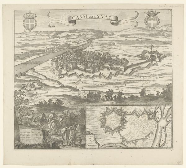
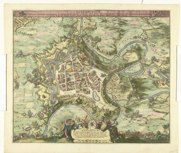
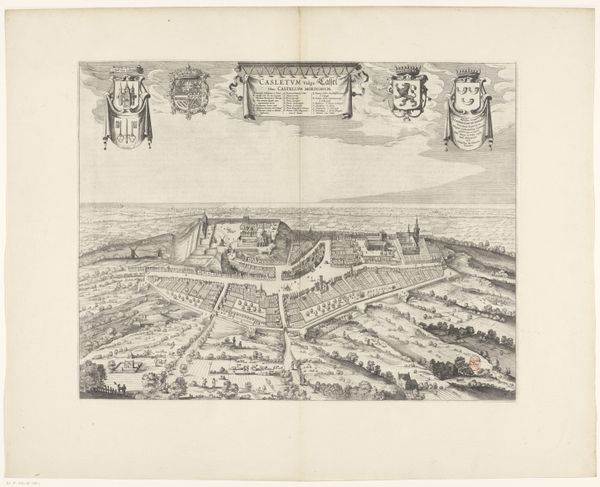
Curator: This image, called "Plattegrond van en gezicht op Trier," meaning "Map and view of Trier," dates from somewhere between 1737 and 1757. It's an engraving, quite detailed, showcasing a bird's-eye view of the city, likely crafted by an anonymous artist. Editor: My immediate thought? It's a storybook waiting to happen. All those precise little sections and vibrant pastel colors, it almost feels edible. And those tiny forests… it sparks a sense of magical realism, a feeling like I’m peering into someone's dreams. Curator: Absolutely, it has a baroque flair to it. We can situate it in a moment when cartography was both science and art, a projection of power as much as a guide. Notice how the city is presented as an organized, fortified space—implying control and order. Editor: I see it! It's almost aggressively orderly, isn’t it? The landscape surrounding Trier seems…well, tamed. Look at how the city is central, framed, even, by the river. This isn’t just a map; it's a declaration of dominion over the natural world, a little power fantasy in print form. Curator: Precisely. And if we consider this image in the context of, say, urban planning, we could argue that it promotes certain social hierarchies through the depiction of space. Who gets to be within the walls, who is outside, in the undefined “wilderness?” Editor: That’s huge. It isn't only about bricks and mortar but about shaping behavior, designating certain identities, and maintaining systems of oppression that have historically affected communities living on the margins. Did that anonymous artist consider how this plattegrond will normalize particular injustices? Maybe? Curator: Possibly. The symbols on the sides add layers too – heraldry, a scene of fortifications, an ensemble of divine figures; they're loaded. Editor: Exactly, it’s this layered symbolism mixed with that almost whimsical color palette, that draws me in. It's a historical document wrapped in an artist’s peculiar vision, sparking thoughts around power and space, but told with unusual flair. Curator: It does leave me thinking about the tension between objectivity and artistic intent inherent in these types of representations. It’s never truly neutral, is it? Editor: No way, that's precisely where its strength resides, right? As something that encourages conversations, challenges viewpoints, and keeps asking “What story are we actually telling here, and who is telling it?”
Comments
No comments
Be the first to comment and join the conversation on the ultimate creative platform.
More like this