drawing, ink
#
drawing
#
script typography
#
hand-lettering
#
lettering
#
playful lettering
#
hand drawn type
#
hand lettering
#
ink
#
hand-drawn typeface
#
fading type
#
typography style
#
calligraphy
#
small lettering
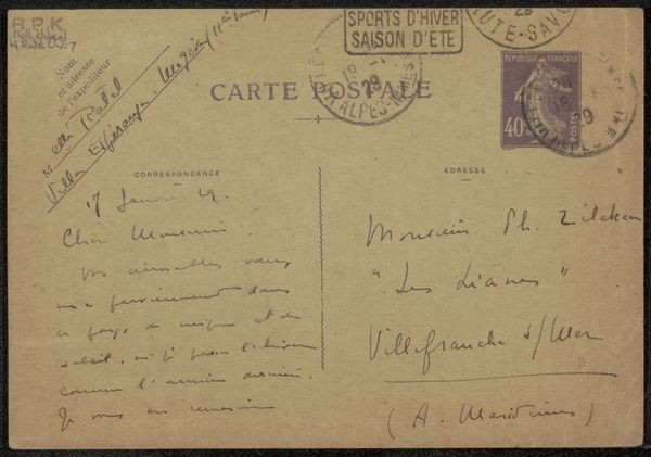
Copyright: Rijks Museum: Open Domain
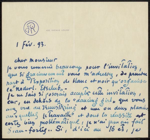
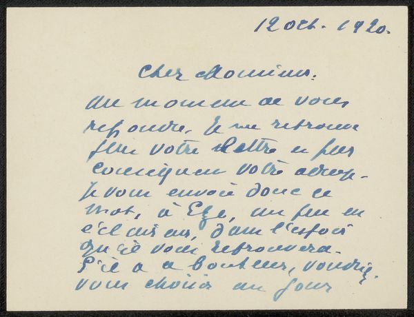
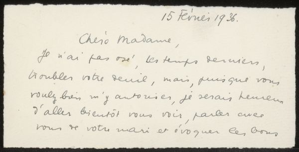
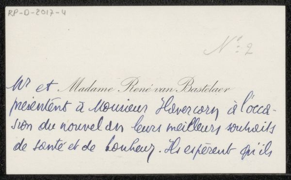
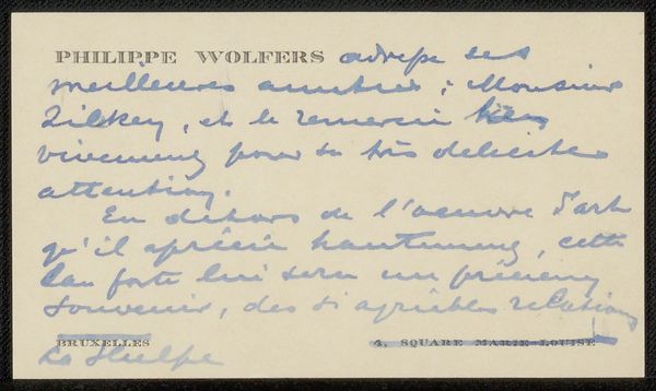
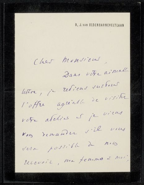
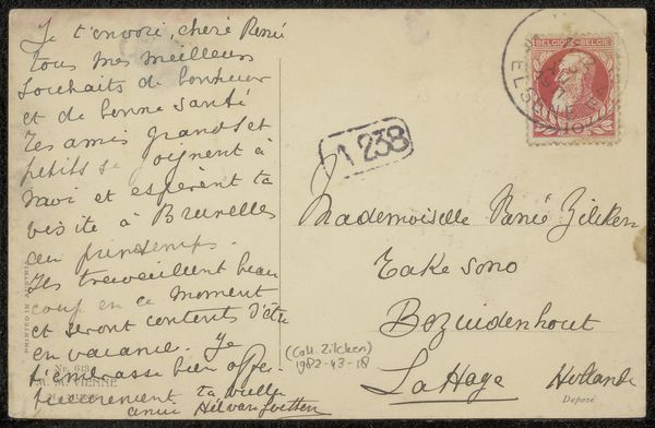
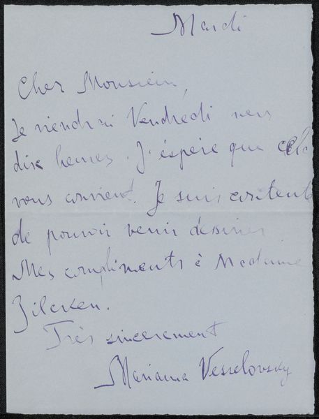
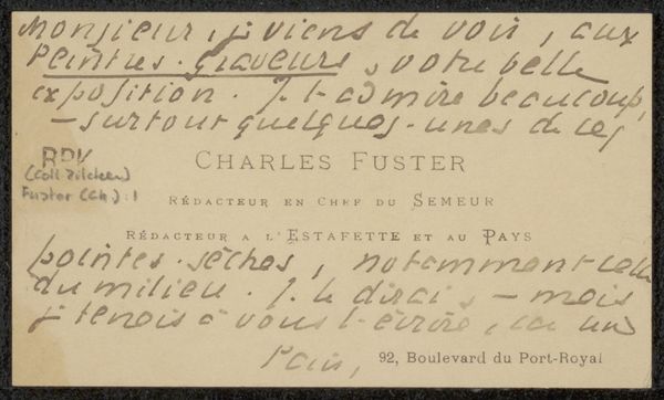
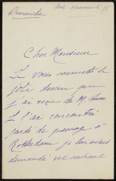
Curator: Here we have “Brief aan Henriette Wilhelmina van Baak”, or "Letter to Henriette Wilhelmina van Baak," attributed to Catherine Galitzine. It’s likely dated between 1921 and 1928 and rendered in ink. My first reaction is the casual tone and informal character conveyed by handwriting on what looks to be a preprinted postcard. Editor: Immediately striking is the way Galitzine uses script typography and playful hand-lettering to form the content of a letter, but also to construct its formal compositional values, something reminiscent of Dada collages. The weight and form of the looping ascenders and descenders in that italicized font structure the viewer's attention, the fading ink giving depth, which I think mirrors the text itself, almost creating a visual, structural melancholy, while highlighting the medium of the handwriting. Curator: Considering the social implications, the handwritten letter provides an intimate counterpoint to the standardized printed postcard format. There’s a palpable sense of direct, personal communication that is becoming, even at that time, challenged by new communications technologies. This almost archaic approach becomes performative, amplifying the content. Also, its preservation by Collection Zilcken further imbues this image with historical gravitas. Editor: Indeed, but beyond the archival significance, I want to bring us back to the sheer, gorgeous materiality of that ink, bleeding just so against the ground, those variations in pressure, which act almost as micro-gestures, creating rhythm—echoes of a unique authorial hand. I also would posit the act of calligraphy and small lettering as part of the texture. I would be keen to analyze this based on its structural impact within this compact composition. Curator: What fascinates me, though, is how such personal gestures exist publicly. This tension between private sentiment and public display highlights the interesting cultural function a work like this performs: turning the quotidian into something historically and aesthetically resonant, an aspect particularly valued in the Roaring Twenties cultural ethos. Editor: Fair, I agree—the interplay of script and surface makes it something that is incredibly thoughtful from both a formal and an intellectual standpoint. It's more than just ink; it's almost a language.
Comments
No comments
Be the first to comment and join the conversation on the ultimate creative platform.
More like this