drawing, graphic-art, print, paper, ink
portrait
drawing
graphic-art
hand written
script typography
hand-lettering
hand drawn type
hand lettering
paper
ink
hand-written
hand-drawn typeface
intimism
stylized text
thick font
handwritten font
modernism
Copyright: Rijks Museum: Open Domain
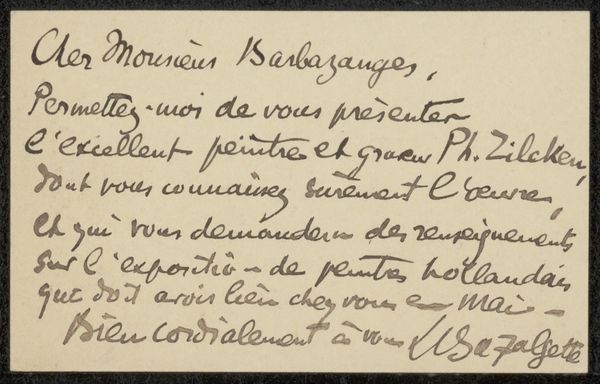
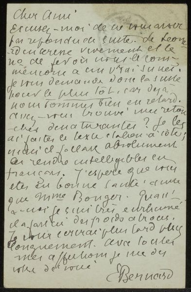
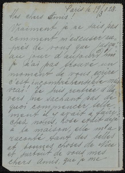
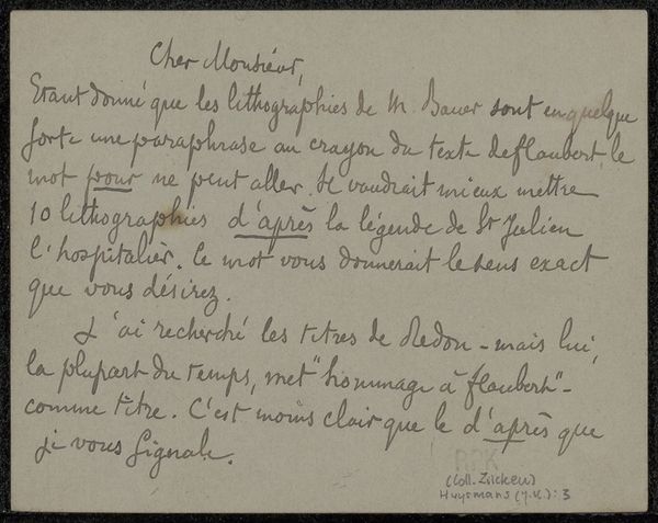
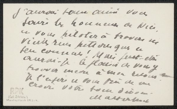
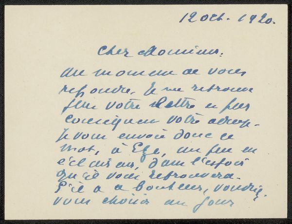
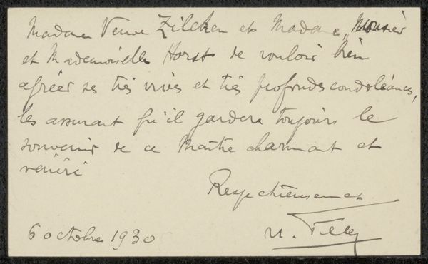
Curator: We’re looking at a calling card by Charles Fuster, dating from before 1894. It's rendered in ink on paper. Editor: My first thought is how intimate this little graphic artwork feels. It’s all script, dense, with this incredibly personal touch. Like peeking at a handwritten note, it presents the materiality of script itself, foregrounding surface. Curator: It's precisely that intimacy which makes it interesting. Think about the culture of correspondence and social exchange in late 19th-century Paris. These calling cards were miniature declarations of self, performing social rituals. This one acknowledges someone's "belle exposition." Editor: Yes, and note how Fuster experiments with the relationship between different typographic hierarchies, using contrast and thickness to emphasize "CHARLES FUSTER" against the adjacent texts and the address at the bottom, making a clear separation. Curator: Absolutely, Fuster wasn’t just declaring his name but also performing his professional identity— "Rédacteur en chef du Semeur"—chief editor of The Sower, suggesting intellectual and political leanings towards sowing ideas. We might investigate this particular magazine more to clarify the connection to social, and political movements and ideologies prevalent at the time. Editor: Good point, if one reads carefully, you can identify multiple layers of contrasting fonts used to suggest meaning by breaking with rigid linear layout. Semiotics allow viewers to associate specific ideas, actions or attributes to the portrayed personage. Curator: It’s also striking that much of the writing is informal, like a message scribbled on the card after it was printed, noting an appreciation for the recipient's "dry points." This collapsing of formal and informal scripts suggests a fluidity of identity. He then proceeds to mention to “tenois à vous l’évrore ca un”, it seems a mysterious and warm thank you! Editor: Ultimately, Fuster reveals and plays with layers, the artist experiments on the semiotics and forms a multi-layered dialogue within a contained shape that one cannot cease exploring with its sight. Curator: Indeed. It gives insight into a cultural moment. I'm reminded of the intricate networks that underpinned the Parisian art scene at the time. Editor: What a stimulating look at art history through such an immediate and relatable artifact!
Comments
No comments
Be the first to comment and join the conversation on the ultimate creative platform.