drawing, mixed-media, paper, ink
#
drawing
#
mixed-media
#
hand-lettering
#
ink paper printed
#
hand drawn type
#
hand lettering
#
paper
#
personal sketchbook
#
ink
#
hand-drawn typeface
#
calligraphic
#
sketchbook drawing
#
sketchbook art
#
calligraphy
#
small lettering
Copyright: Rijks Museum: Open Domain
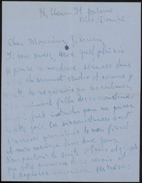
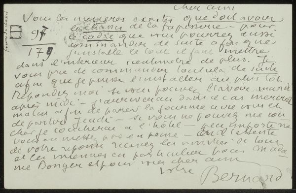
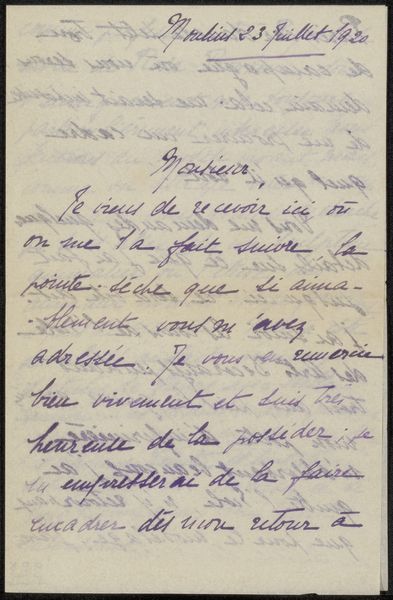
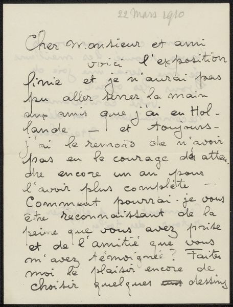
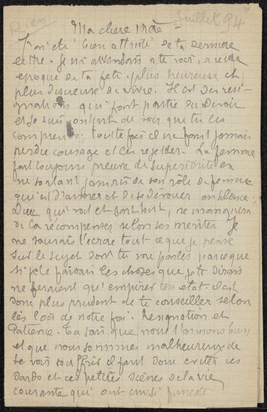
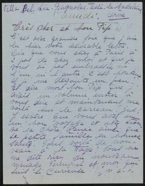
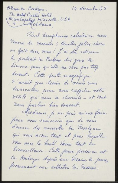
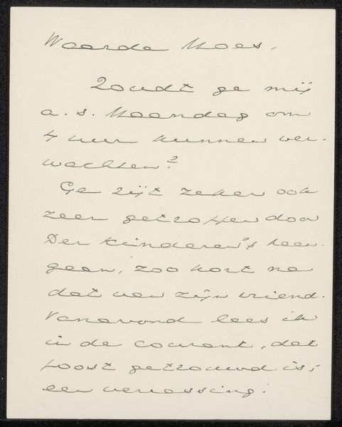
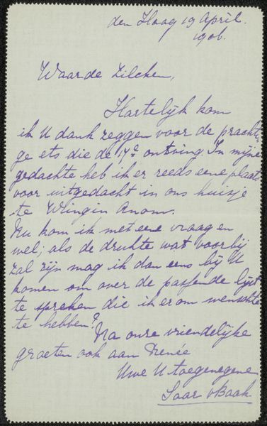
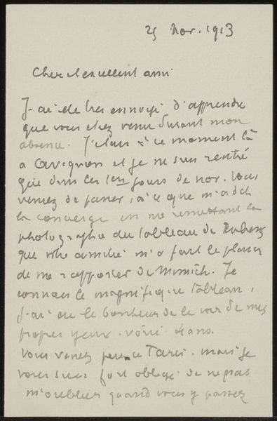
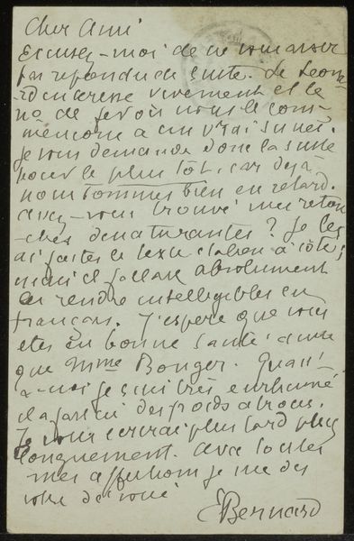
Curator: Looking at "Brief aan Philip Zilcken" attributed to Marianne von der Launitz, created before 1928 using ink and mixed media on paper, it immediately strikes me as intimate, almost vulnerable. Editor: It has a certain fragility to it, doesn't it? You can almost feel the texture of the paper and the hand that held the pen. Tell me more about the materiality. Curator: Certainly. The visible fibres of the paper, the varying thickness of the ink strokes, all speak to a very direct, unfiltered creative process. It blurs the lines between the functional act of letter writing and the intentional creation of art. We are so used to pristine displays in our museums, the beauty of such handmade and heartfelt pieces tend to often be overlooked in artistic studies. Editor: Absolutely. It’s interesting to consider the social function too, isn't it? The very act of sending and receiving this letter. Who was Philip Zilcken, and how might their relationship have influenced both the creation and reception of this piece? We understand letter writing has historically played an important role in many power dynamics and art market ecosystems. Curator: Precisely. And this letter serves as a perfect example: How much influence and social presence did Zilcken have and what implications that bore for Marianne von der Launitz? Understanding the broader artistic community helps reveal the motivations and intentions that may not immediately meet the eye. Editor: Right. The letter becomes less about the surface level intention and more a negotiation for opportunity through formal channels, shaped by societal rules and power structures. The careful, deliberate hand-lettering is a part of it, another means to express herself formally within the cultural norms of that time. Curator: Precisely. This shifts our perception. Seeing it less as an individual expression, more of a piece within a network. The small variations in letter size can express emotion. What seems simply personal is intertwined with broader cultural forces. Editor: It certainly pushes us to examine the frameworks we impose upon art history, understanding production, consumption, and labor that so greatly affected women's social position within the field. Curator: Absolutely. Editor: Well, I'm definitely going to keep that in mind as I re-evaluate my first impression now that I have this knowledge about materials and culture at hand.
Comments
No comments
Be the first to comment and join the conversation on the ultimate creative platform.
More like this