drawing, paper, pen
#
drawing
#
script typography
#
hand-lettering
#
hand drawn type
#
feminine typography
#
hand lettering
#
paper
#
hand-drawn typeface
#
thick font
#
typography style
#
pen
#
handwritten font
#
small lettering
Copyright: Rijks Museum: Open Domain
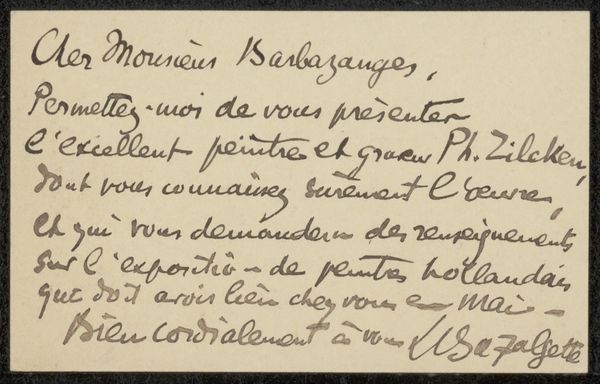
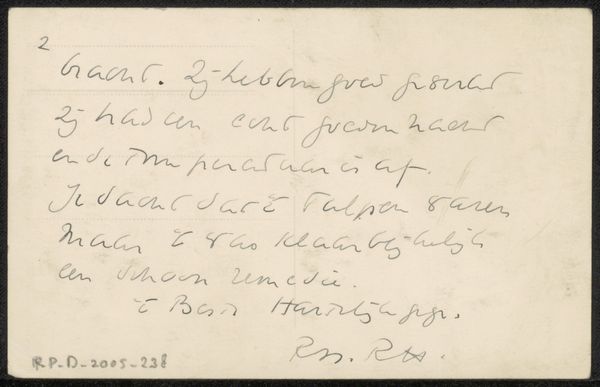
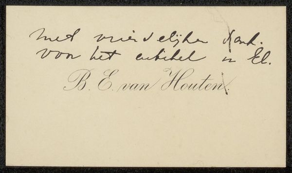
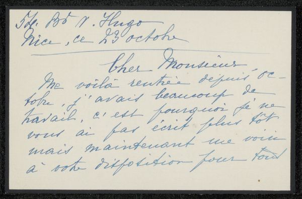
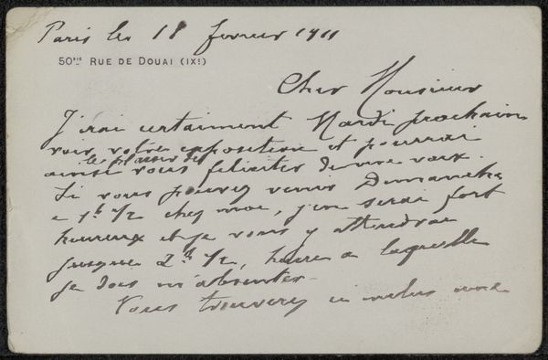
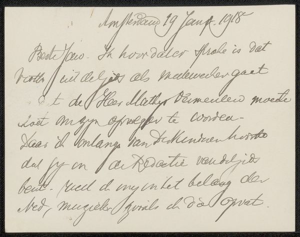
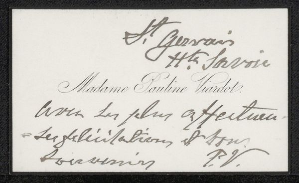
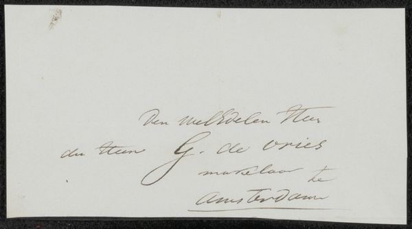
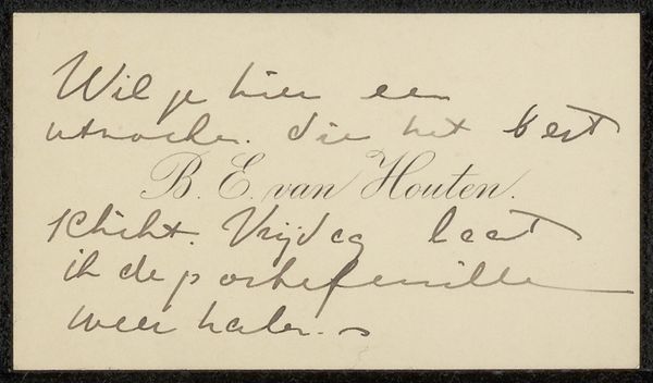
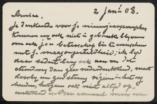
This is a card by mevrouw Van Bastelaer, made using ink on paper. I love the way the letters dance across the page, each stroke a little different, a little wobbly, but full of character. It reminds me that artmaking is a process, a journey of the hand and mind working together. The blue ink is so alive against the stark white, a simple contrast that speaks volumes. You can almost feel the pressure of the pen on the paper. The artist isn't trying to hide anything, every tremor and flourish is right there on display. Look at the way the ink pools in some areas, creating darker, more intense blues. It's like a secret language whispered between the artist and the viewer. This card shares something with the spontaneous energy of Cy Twombly's scribbles, a sense of freedom and playfulness that transcends the formal constraints of the medium. Ultimately, it's a reminder that art is about connection, about sharing a moment of beauty and humanity with others.
Comments
No comments
Be the first to comment and join the conversation on the ultimate creative platform.
More like this