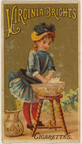
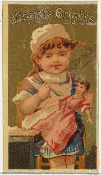
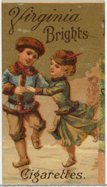
From the Girls and Children series (N64) promoting Virginia Brights Cigarettes for Allen & Ginter brand tobacco products 1886
0:00
0:00
drawing, coloured-pencil, print
#
drawing
#
coloured-pencil
# print
#
figuration
#
coloured pencil
#
genre-painting
Dimensions: Sheet: 2 5/8 × 1 1/2 in. (6.7 × 3.8 cm)
Copyright: Public Domain
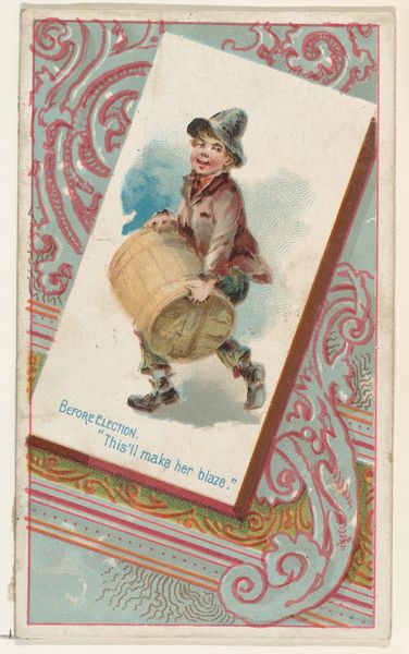
Curator: So, this rather unsettling little tableau is from a series called "Girls and Children," a chromolithograph crafted around 1886 by Allen & Ginter as a promotional item for Virginia Brights cigarettes. Quite the marketing strategy, wouldn't you agree? Editor: Unsettling is the perfect word! There's this unsettling contrast, isn't there? The twee depiction of childhood innocence paired with…well, cigarette marketing. The girl’s peering through this oddly prominent gate and it makes me feel claustrophobic, despite the presumed open air. Curator: It’s a jarring combination to our modern sensibilities, but these were different times. Let’s unpack it. Notice the girl’s attire. That winsome cap. That striped and floral combo, an unsettling nod to domesticity and an old fashioned feel even for its own time. And the implied narrative – what’s she guarding, and why with a broom? Is this a subtle reference to ‘sweeping clean’ or… Editor: I think that’s the central tension – she's dressed in what looks like a parody of a child's costume, peering through this...thing; like an imitation jail or an overgrown playpen. The 'Virginia' paper in her hand—a tease, really. Are we meant to buy Virginia Brights to…get inside? To unlock something? To me the choice of color makes everything heavy, and those vertical bars of the fence, those repeat and emphasize, it’s almost like prison stripes. Curator: The semiotics are rife, aren’t they? You've touched upon some core aspects and yet, and for what it’s worth, the formal elements contribute in surprising ways. The composition is static, almost stage-like, and then you consider that even something seemingly small like color pencil strokes have so much impact here, since it looks more like a colored drawing. It adds intimacy. The child is like something both hyper-real and deeply fabricated all at once. I would imagine folks back then responded in complex ways, a testament to their craft. Editor: Complex and confusing indeed. One wonders if those original customers even registered the implications in this illustration of childhood, domestic space, the illusion of freedom versus its actual constrictions, or maybe, did they see past them? It remains elusive even now, and perhaps it will for many years to come. Curator: Perhaps its these open questions about intention and outcome that can reveal unexpected insight. Thanks for exploring with me today.
Comments
No comments
Be the first to comment and join the conversation on the ultimate creative platform.
More like this