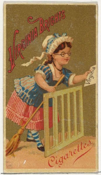
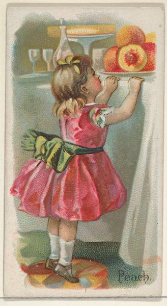
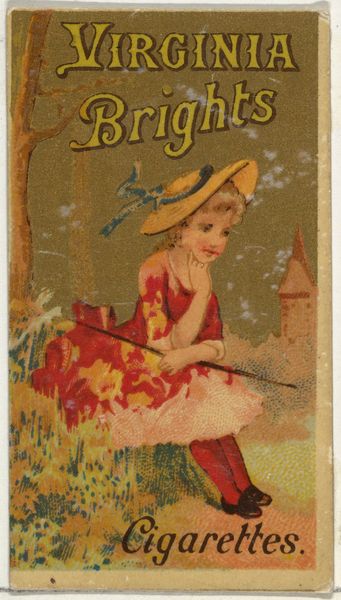
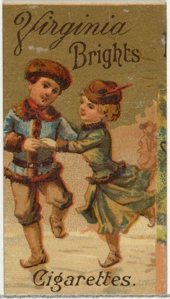
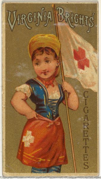
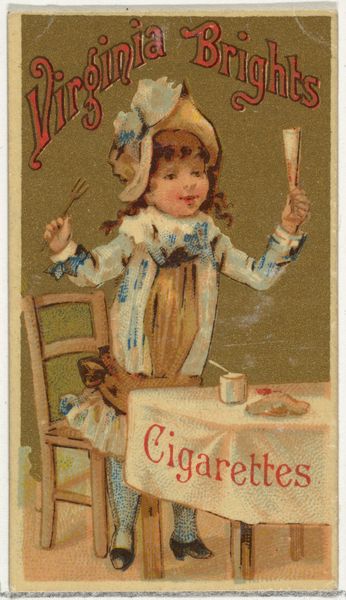
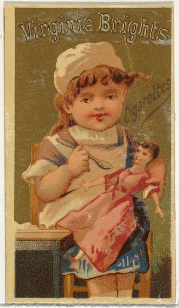
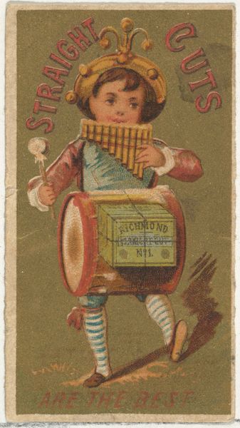
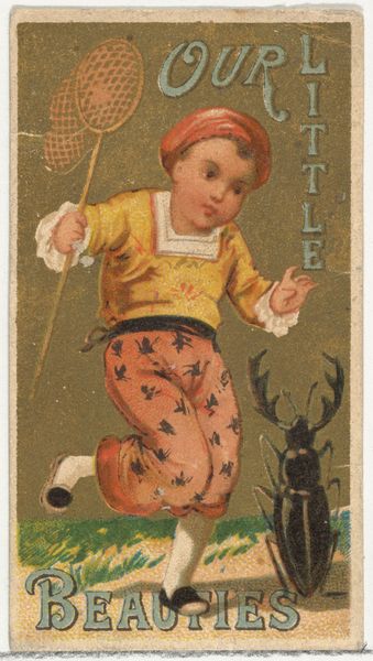
From the Girls and Children series (N64) promoting Virginia Brights Cigarettes for Allen & Ginter brand tobacco products 1886
0:00
0:00
drawing, print
#
drawing
#
girl
#
water colours
#
egg art
# print
#
possibly oil pastel
#
handmade artwork painting
#
oil painting
#
coloured pencil
#
coffee painting
#
painting painterly
#
watercolour illustration
#
watercolor
Dimensions: Sheet: 2 5/8 × 1 1/2 in. (6.7 × 3.8 cm)
Copyright: Public Domain
Curator: Here we have an interesting piece from 1886, titled "From the Girls and Children series (N64) promoting Virginia Brights Cigarettes for Allen & Ginter brand tobacco products," currently held in the Metropolitan Museum of Art. Editor: Well, immediately, I'm struck by its unsettling innocence. The vibrant colours, the delicate rendering of the girl, contrasts so sharply with the overt commercial purpose emblazoned at the top. There’s a tension there that grabs you. Curator: Exactly! These trade cards were designed to be collected, part of a wider phenomenon of using childhood imagery to soften the edges of tobacco consumption. The "Virginia Brights" brand clearly aims to associate itself with purity and domesticity. Editor: It's clever, in a disturbing way. The soft, almost pastel-like application of what seems like watercolor or maybe oil pastel lends an air of quaintness to the scene. Her blue dress and little hat, the patterned stool, all add to a very studied naiveté. It is meant to create a safe feeling and distract us from a hard-sell advertising of harmful items. Curator: The composition further emphasizes this calculated innocence. The girl is positioned centrally, framed by domestic items, but it's all a very deliberate construct. Note how her attention is entirely focused on her chore. Editor: I see the foreground. How she's positioned relative to the tub, the pitcher nearby— they all construct a clear, legible narrative, emphasizing labour and subservience from an early age. What do we make of the stool with twisted bars in the centre, or of that odd pitcher off to the side? Are these more overt markers to a privileged lifestyle for some, while for others, a mere promise or prospect to be had? Curator: Indeed. Allen & Ginter's marketing often played on these societal aspirations and presented a romanticised, idealized version of domestic life—especially where commodities and capitalist exploits were concerned, conveniently overlooking social realities. This is to create the allure of American Dreams that can be achieved with hard work. Editor: A curious insight for sure. It's fascinating how the interplay of colour and design reinforces a complex message. You can almost feel the societal pressures baked into the pigment itself. Curator: Precisely. It's a small image but speaks volumes about the values being promoted during the late 19th century. It reminds us to look deeper into not only art history, but society itself. Editor: And, for me, a testament to how formal analysis, when thoughtfully applied, can unearth uncomfortable truths hidden within seemingly innocuous aesthetics.
Comments
No comments
Be the first to comment and join the conversation on the ultimate creative platform.
More like this