Ontwerp van een schrijfvoorbeeld: A Mons. Jean vande Veke (...) 1605
0:00
0:00
janvandeveldei
Rijksmuseum
drawing, typography, ink, pen
#
word art style
#
drawing
#
hand-lettering
#
lettering
#
hand drawn type
#
hand lettering
#
word art
#
typography
#
ink
#
hand-drawn typeface
#
calligraphic
#
typography style
#
line
#
pen
#
northern-renaissance
#
calligraphy
#
small lettering
Dimensions: height 202 mm, width 304 mm
Copyright: Rijks Museum: Open Domain
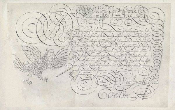
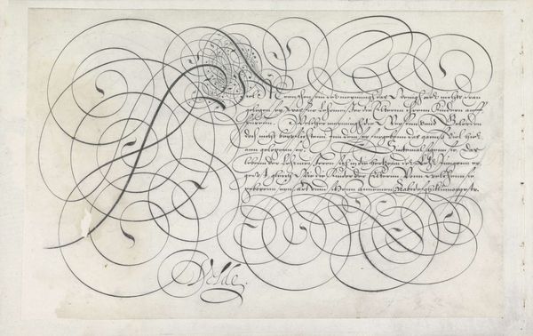
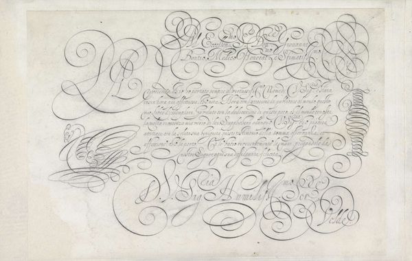
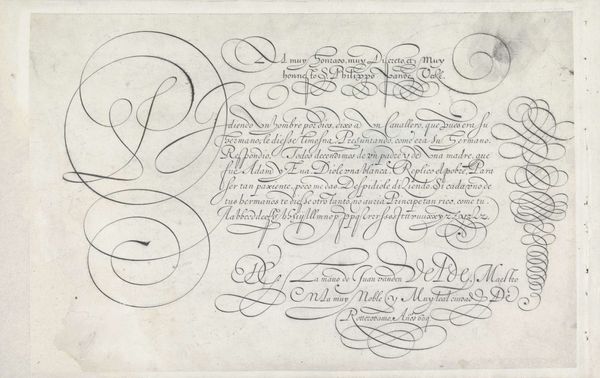
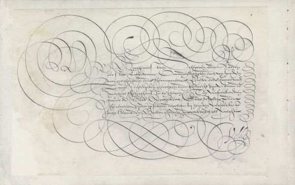
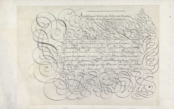
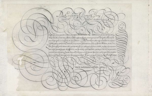
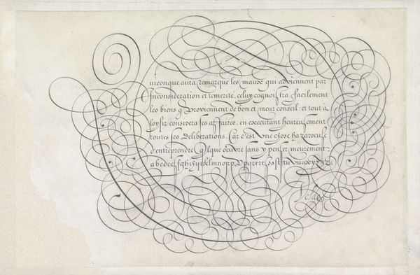
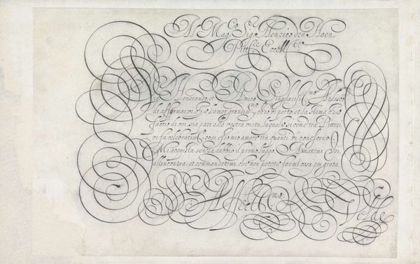
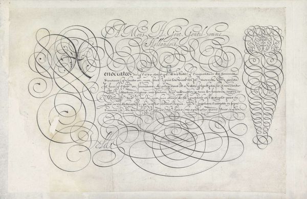
Jan van de Velde the first made this pen and ink writing sample sometime in the late 16th or early 17th century. It demonstrates the elaborate, stylized penmanship valued in the Dutch Republic at the time. Beyond its aesthetic qualities, calligraphy like this had a distinct social function. In a society increasingly driven by commerce and bureaucracy, legible and elegant handwriting was a necessary skill for merchants, clerks, and administrators. Manuals and model books such as this one helped to standardize handwriting styles and teach penmanship to a growing literate population. We can see how the image creates meaning by noting the ship on the right which speaks to the culture of trade in the Netherlands. Also, the figure of cupid with a bow and arrow on the left speaks to social aspirations of courtly love. Understanding the social and institutional context of this writing sample requires careful historical research. By studying contemporary manuals, business records, and personal correspondence, we can better appreciate the role of handwriting in shaping Dutch society and culture.
Comments
No comments
Be the first to comment and join the conversation on the ultimate creative platform.
More like this