graphic-art, print, typography, engraving
#
graphic-art
#
baroque
# print
#
old engraving style
#
hand drawn type
#
typography
#
geometric
#
line
#
engraving
#
calligraphy
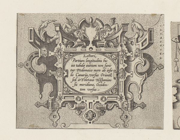
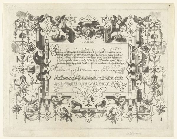
Dimensions: height 206 mm, width 278 mm
Copyright: Rijks Museum: Open Domain
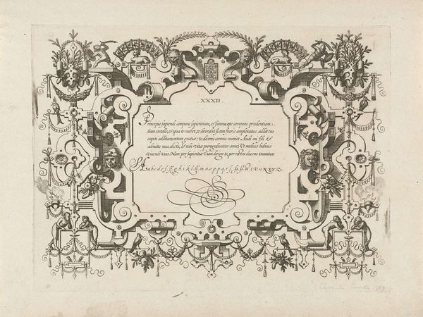
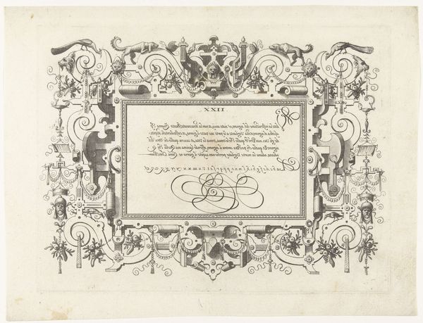
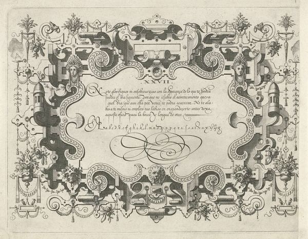
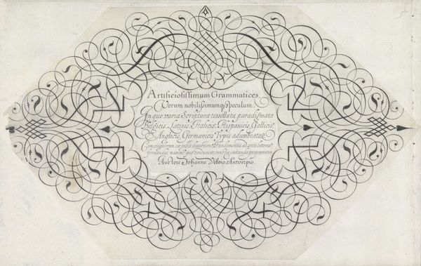
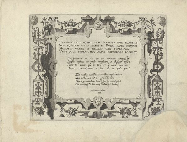
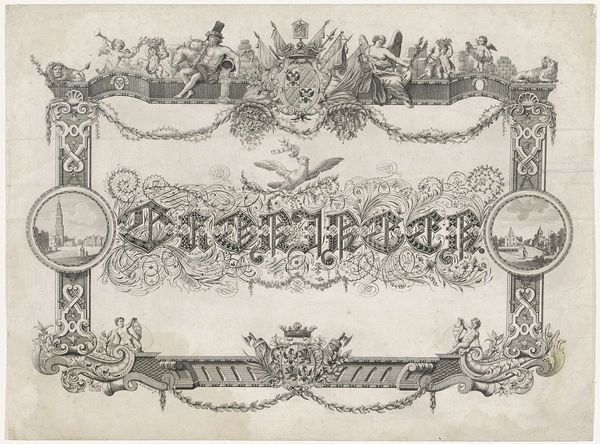
Editor: This is "Titelblad: Grammato-Graphices. In Quo Varia Scripurae Emblemata," an engraving by Cornelis Dircksz. Boissens, created in 1605. It's incredibly detailed, a beautiful example of typography as art. I’m curious about your interpretation. What stands out to you in its formal structure? Curator: Notice first the careful distribution of visual weight, the counterpoint between the dense script and the airy flourishes of the surrounding ornamentation. Consider the frame itself: observe how geometric shapes integrate with organic curves to contain and highlight the calligraphic forms, almost as if the lines themselves create an emblem. Do you see the implied dynamism despite the static nature of the print? Editor: I do. It's not just a border; it seems to almost want to contain the text. Are you suggesting this visual tension serves to emphasize the script as the main subject of the artwork? Curator: Precisely. It prompts us to dissect the relationships between each element—the positive and negative space, the interplay of textures suggested by the engraving technique, and the proportional balance across the entire composition. Ask yourself: does the artist favor function over decoration? Editor: It’s a functional piece showcasing typography, but elevated to art through exquisite line work and layout. I see how analyzing these individual components provides an enriching encounter with the piece. Curator: Yes, our analysis of structure and technique offers tangible tools to comprehend its design and ultimately, its beauty.
Comments
No comments
Be the first to comment and join the conversation on the ultimate creative platform.
More like this