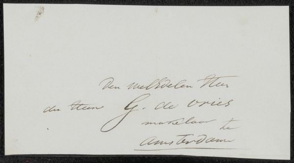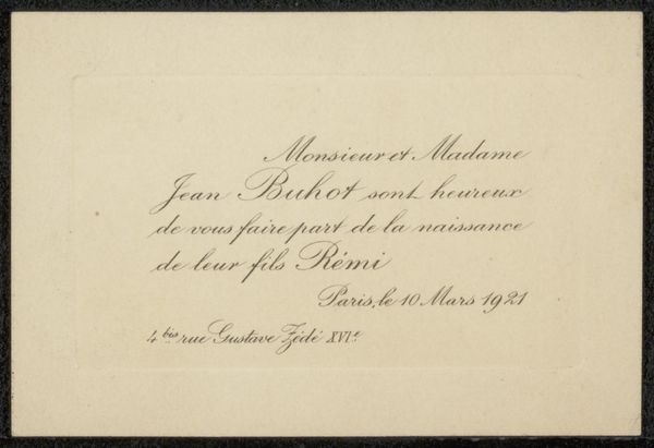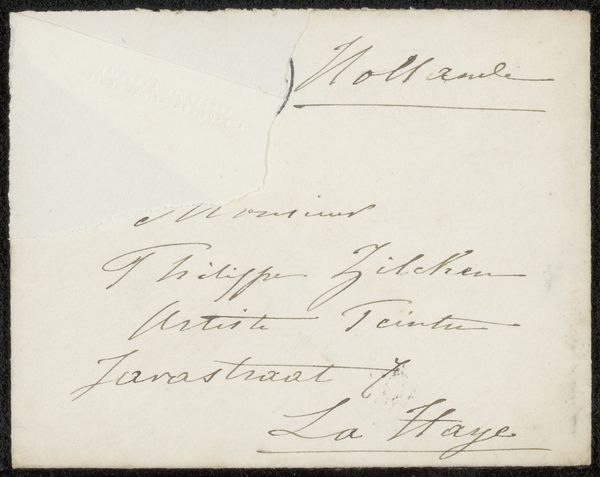
1834 - 1910
Visitekaartje aan Philip Zilcken
Listen to curator's interpretation
Curatorial notes
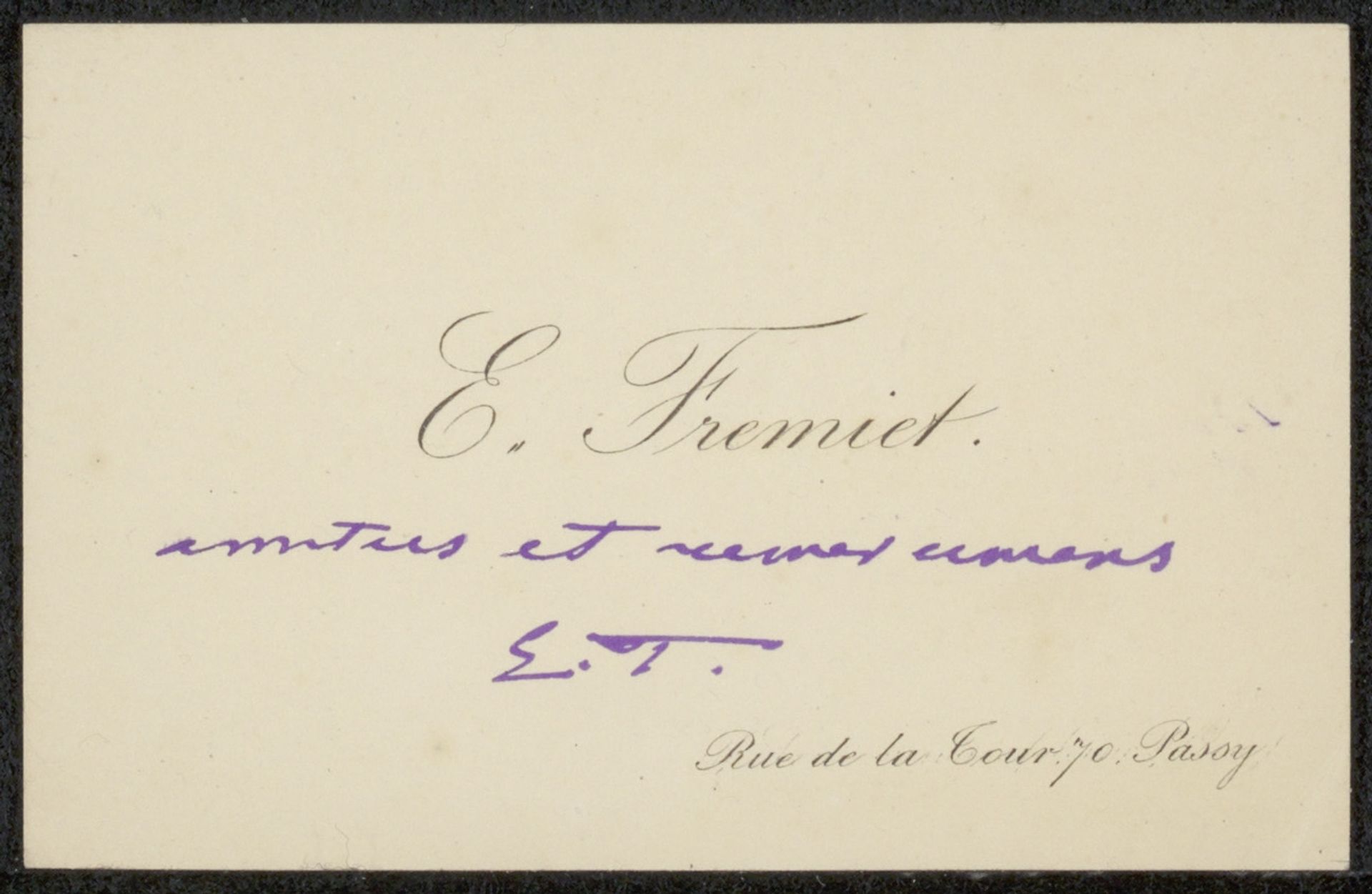
Curator: The piece we're looking at is titled "Visitekaartje aan Philip Zilcken," essentially a calling card by Emmanuel Frémiet, dating between 1834 and 1910, rendered in ink. Editor: My first thought is its elegance—the contrast between the delicate script and the presumed formality of its purpose is charming. The slight irregularities in the inking give it a personal touch. Curator: Exactly. Calling cards like these were powerful social currencies. Think about the act of presenting one: it's a gesture of introduction, of belonging to a certain social sphere. This wasn't just about providing contact information; it was about social positioning and conveying respectability. Editor: I’m struck by how Frémiet has used the ink to create variations in line weight. The flourishes add a certain rhythm. You see that particularly in the name “E. Frémiet,” where the letterforms almost dance. It isn's just informational; it's a deliberate aesthetic statement. Curator: It's also intriguing to note that this calling card, though small, was likely a precursor to more formal portraiture Frémiet was doing at the time. The address is carefully placed; it almost signifies physical roots and credibility. The addition of what seems to be “amitiés et reves communs”, indicates shared hopes, weaving into the performance of cultivated connection. Editor: Right, it turns a simple name card into something richer— a shared sentiment. Considering the shades of black and subtle variation within the script, its impact remains striking even with so few visual elements. The whole piece speaks of a personality, distilled into textual form. Curator: And that distillation reflects societal structures, artistic practice and modes of networking. An item like this says so much about the era, the importance of social relationships in artistic patronage, and, quite plainly, getting one's name out there. Editor: Looking closely, the intimacy inherent in that ink on paper—that hand-rendered, slightly uneven script is genuinely moving. I didn't expect a small card to evoke such emotion. Curator: Indeed; the past is inscribed within these documents. It shows us a window into a world of connections and artistic promotion—revealing how individuals carefully shaped their public identities. Editor: Yes, a tiny artefact that leaves a resonant visual echo of those societal structures.