drawing, paper, ink
#
portrait
#
script typeface
#
drawing
#
script typography
#
hand-lettering
#
old engraving style
#
hand drawn type
#
feminine typography
#
hand lettering
#
paper
#
ink
#
hand-drawn typeface
#
intimism
#
thick font
#
handwritten font
#
calligraphy
Copyright: Rijks Museum: Open Domain
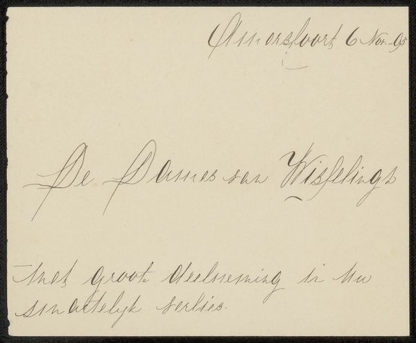
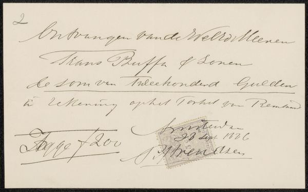
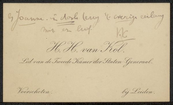
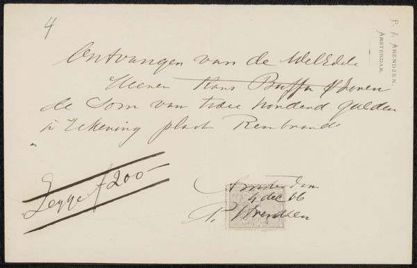
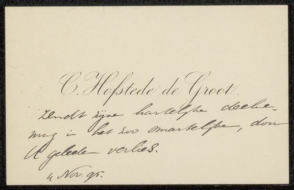
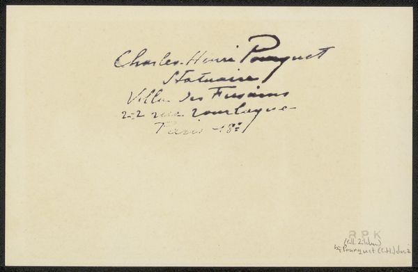
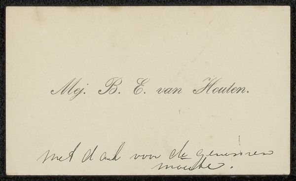
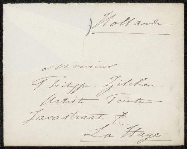
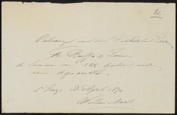
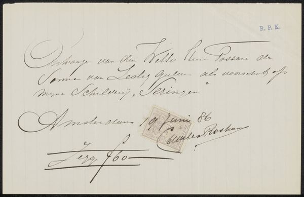
This calling card was created by Cornelis Peter David Pape, using paper and ink. The physical card itself is quite simple, but its creation speaks to a specific social context. The calligraphy, with its elegant flourishes, suggests the importance of penmanship as a skill—a learned practice that signified education and social standing. This wasn't just about conveying information; it was about presenting oneself in a particular light. The card's message, a note of thanks, also highlights social conventions and the importance of maintaining relationships within a community. Consider the production of paper at the time. Was it handmade, or machine-made? The texture and weight of the paper would have added to the overall impression. Ultimately, this calling card is a reminder that even seemingly simple objects can offer insights into the values, skills, and social dynamics of a particular time and place. It encourages us to look beyond the surface and consider the craftsmanship and context that give meaning to everyday items.
Comments
No comments
Be the first to comment and join the conversation on the ultimate creative platform.
More like this