drawing, paper, ink
#
portrait
#
script typeface
#
drawing
#
hand written
#
script typography
#
hand-lettering
#
hand drawn type
#
feminine typography
#
hand lettering
#
paper
#
ink
#
hand-drawn typeface
#
thick font
#
handwritten font
#
calligraphy
Copyright: Rijks Museum: Open Domain
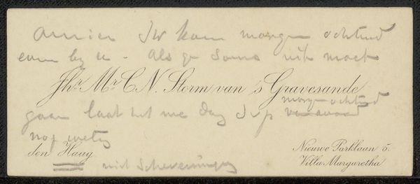
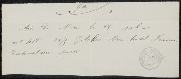
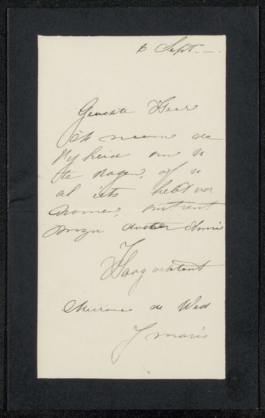
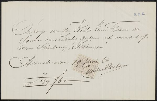
Hendrikus Hubertus van Kol made this calling card for Philip Zilcken using ink on paper. The strokes are economical but flourish in the grandiose loops and swoops that you see in the main body of the text. What really grabs me is the handwritten note at the top. Scribbled and underlined, it feels so personal, as though we are witnessing a private communication. You know, artmaking can be a lot like that. It's about opening up a space, not just on the page or canvas, but also in our minds. Look at the way the ink thins and thickens, revealing the subtle movements of the hand. There's a dance between intention and chance, control and surrender. It reminds me a little of Cy Twombly’s work, but with a bureaucratic Dutch twist. Ultimately, this little card offers a glimpse into the world of human connection, where words become gestures and meaning is always in motion.
Comments
No comments
Be the first to comment and join the conversation on the ultimate creative platform.
More like this