drawing, paper, ink
#
script typeface
#
drawing
#
script typography
#
hand-lettering
#
hand drawn type
#
hand lettering
#
paper
#
ink
#
hand-drawn typeface
#
intimism
#
thick font
#
typography style
#
handwritten font
#
miniature
#
calligraphy
#
small lettering
Copyright: Rijks Museum: Open Domain
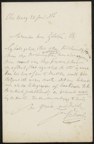
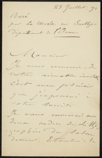
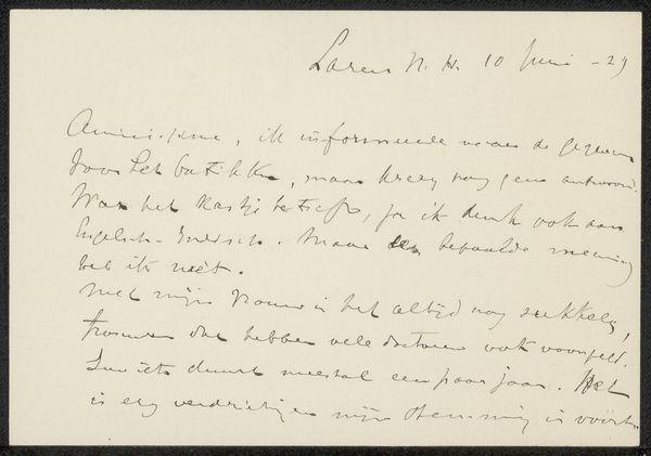
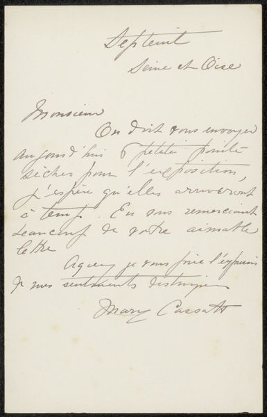
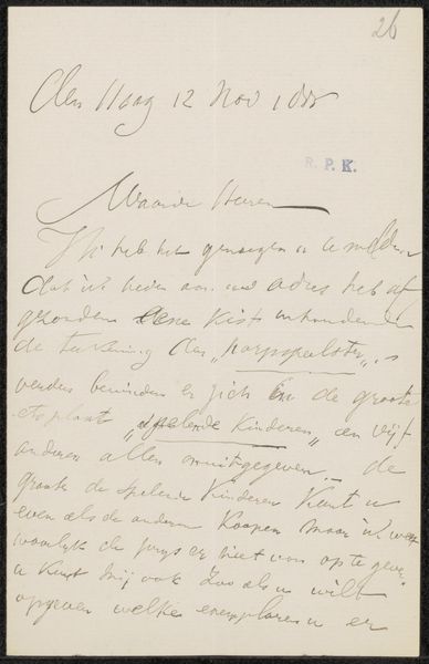
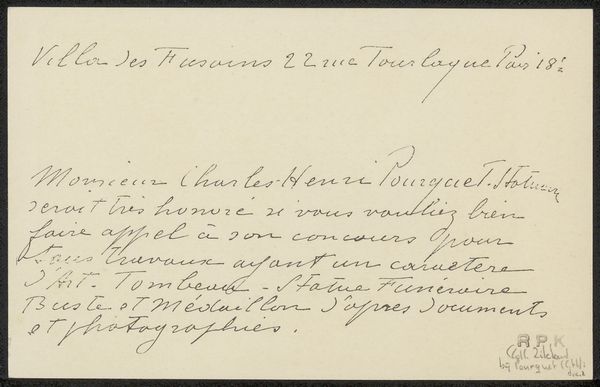
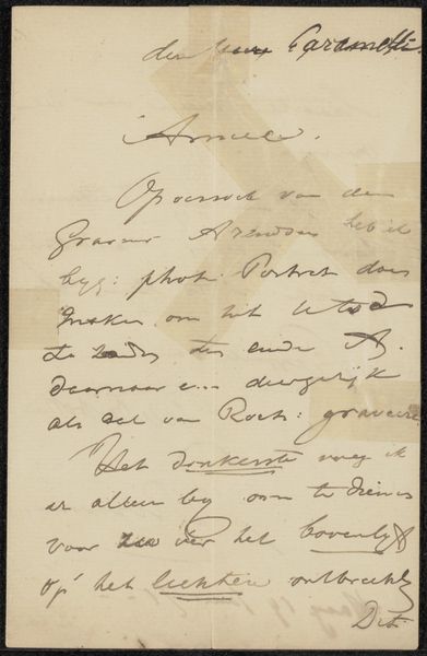
Curator: This delicate object is a calling card, "Visitekaartje aan Philip Zilcken," crafted before 1895 by René Ménard. It's ink on paper, a tiny window into a world of social rituals. Editor: It looks so formal, yet almost frantic. All that swooping calligraphy squeezed onto a small rectangle. You can practically feel the social pressure to respond promptly. Curator: Indeed, the materiality speaks volumes about class and custom. Think of the cost and labour of high-quality ink and paper, the mastery required for elegant penmanship. This card was a miniature declaration of status and refined taste. Editor: And it acts as a record of institutional networks, too. Who was Philip Zilcken? How did Ménard hope this card would shape their relationship? The locations listed suggest networks in Paris intellectual circles. It’s not just a pretty script; it's a tool for social navigation. Curator: Precisely. Consider the circulation of these cards. They weren’t just exchanged once; they became part of a visual economy, shaping perceptions and relationships over time. Each element, from the specific ink to the flourished lettering, reveals the hand of the artisan but also encodes societal values regarding etiquette and personal worth. Editor: It is interesting to view something like a calling card in that light. Now, when people make a snap connection via smartphones, here's a world where relationships required a certain degree of carefully crafted physical presence. Curator: In conclusion, viewing René Ménard's card this way opens discussions on production value, but also to understanding societal structure and interactional dynamics. Editor: Right, beyond the beautiful typeface lies the echo of interactions and aspirations that give this tiny artifact great cultural weight.
Comments
No comments
Be the first to comment and join the conversation on the ultimate creative platform.
More like this