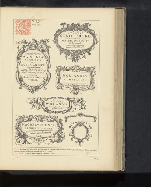
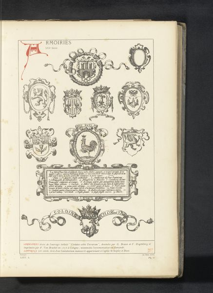
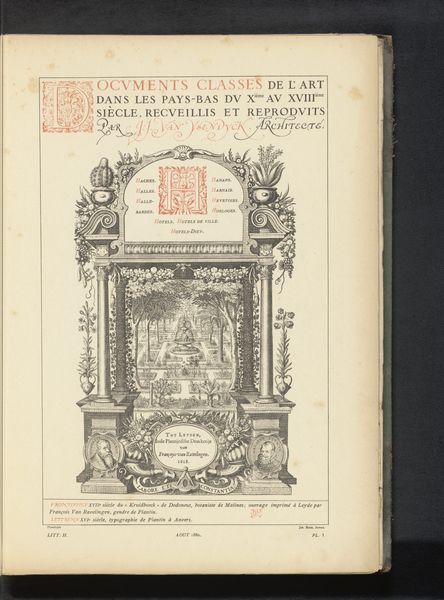
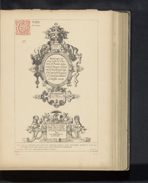
Reproductie van zes cartouches uit Civitates Orbis Terrarum door Georg Braun en Frans Hogenberg before 1880
graphic-art, print, typography, engraving
graphic-art
11_renaissance
typography
engraving
Dimensions: height 434 mm, width 234 mm
Copyright: Rijks Museum: Open Domain
Curator: This work, dating from before 1880, presents a reproduction of six cartouches from *Civitates Orbis Terrarum* by Georg Braun and Frans Hogenberg. The medium is print, a combination of engraving and typography. Editor: The immediate feeling is one of historical document meeting decorative art. These elaborate frames surrounding city names—it’s almost like a branding exercise from centuries ago. The stark contrast, of course, emphasises the engraved line. Curator: Absolutely. The composition compels us to examine each cartouche individually, considering the symmetry, balance, and contrasting textures of the lines. Take, for instance, the upper right frame displaying "Magdeburgum." Editor: Its placement implies a certain hierarchy, wouldn't you say? These aren't merely decorative labels. "Magdeburgum", appears central, positioned at the 'top' to impart status on the given territory within this period? A political gesture, framed in visual presentation. Curator: Quite possibly. Considering the context in which the *Civitates Orbis Terrarum* emerged, such elements are charged. From a formal perspective, the varying frame shapes — square versus oval — coupled with classical motifs, lend individual character to each location. Observe "Palermo’s" more subdued architectural form, contrasting the flamboyant exuberance of Antwerp's cartouche beneath it. Editor: It speaks of civic pride, but also underscores the intense rivalry of the Renaissance city-states, doesn't it? What does the use of decorative language as a marker of place mean today, when we talk of nation states? Curator: Interesting observation. In closing, analyzing these six cartouches unveils far more than geographical names. It reveals an intricate tapestry of symbolic visual languages woven to signify status and political power during a critical historical moment. Editor: A true intersection between aesthetics, and public performance indeed. The act of naming becomes, in effect, a powerful declaration, even a form of persuasive messaging to be digested by consumers of image and text alike.
Comments
No comments
Be the first to comment and join the conversation on the ultimate creative platform.