drawing, print, paper, typography
#
drawing
#
narrative-art
#
dutch-golden-age
# print
#
paper
#
typography
#
geometric
#
genre-painting
#
historical font
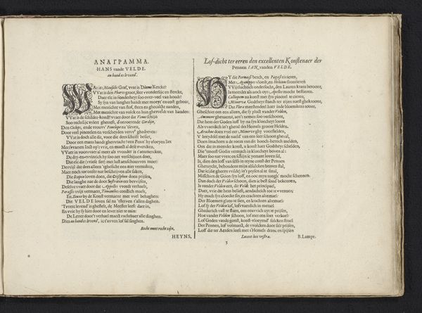
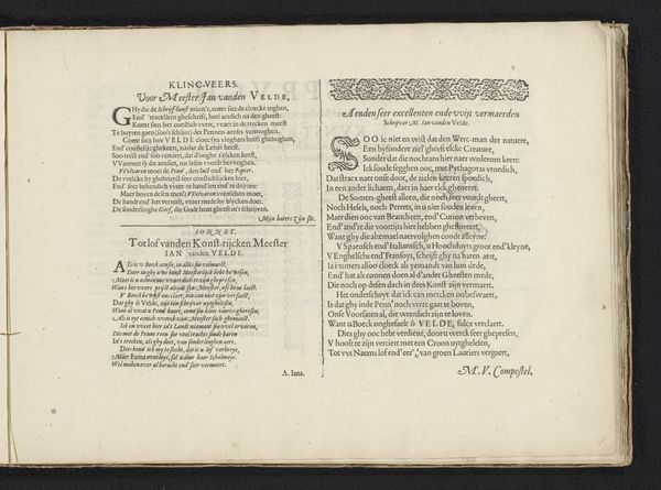
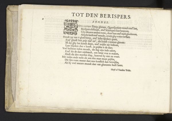
Dimensions: height 261 mm, width 370 mm
Copyright: Rijks Museum: Open Domain
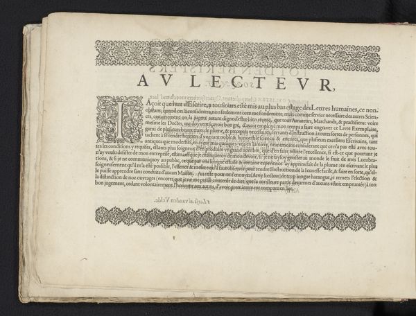
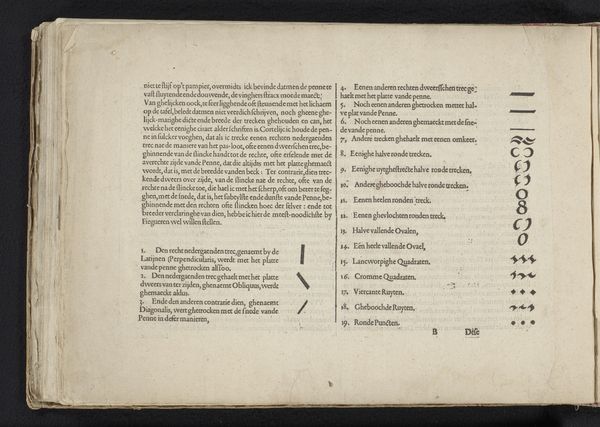
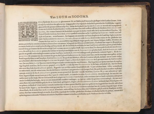
Editor: This is "Sonnet van Jan van de Velde", created in 1608 by Jan van de Velde I. It’s a print, combining drawing, typography, and geometric elements. The text and intricate borders give it such a formal feel. What stands out to you about it? Curator: Immediately, I'm drawn to the socio-cultural context. Printed works like these were pivotal in disseminating ideas during the Dutch Golden Age. Notice how the typography is designed? It aims for an impression of authority and permanence. Editor: That makes sense, it definitely feels deliberate, not spontaneous. Curator: Exactly. Consider also who the "berispers" or critics, were in the 17th century. Were they formal art critics? Intellectuals? Or perhaps other artists? Jan van de Velde's word choice suggests existing tensions, no? It begs the question, was the artist's status somehow linked to the sonnet, shaping what he wanted his public role as artist to be? Editor: You're right! Knowing this print might be a response to criticism definitely colors my interpretation. I see a deliberate act of self-justification, and even a commentary on artistic value. Curator: Indeed. It illustrates the constant negotiation of power and value that shapes artistic production, a vital reminder when approaching art history. What do you make of that 'lust' note towards the end of the inscription? Do you see it as authentic and proud or ironic? Editor: It's thought-provoking! The complexity woven into even what appears a "simple" print, offers insights into the societal dynamics of the time. I’ll never look at typography the same way again. Curator: Agreed. Paying attention to not just the art, but the dialogue _around_ it, is critical for deeper analysis.
Comments
No comments
Be the first to comment and join the conversation on the ultimate creative platform.
More like this