graphic-art, print, textile, paper, typography, engraving
#
graphic-art
#
dutch-golden-age
# print
#
textile
#
paper
#
typography
#
engraving
Dimensions: height 261 mm, width 370 mm
Copyright: Rijks Museum: Open Domain
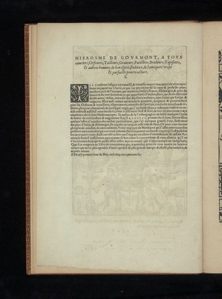
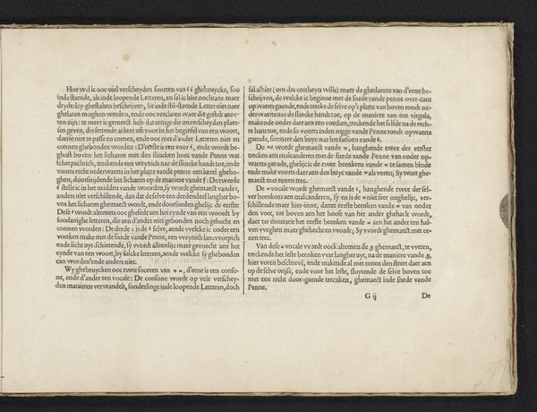
Curator: Looking at Jan van de Velde I's "Aan de Lezer" from 1608, the first thing that strikes me is how the very process of printing, of reproducing text, becomes a central theme. Editor: Indeed, this engraving on paper presents what seems to be a preface or dedication page. It’s interesting to see the use of typography as a decorative element itself. What are your thoughts on how the materials and techniques contribute to the work's meaning? Curator: The choice of engraving, a mechanical reproduction technique, elevates typography. Consider the labour involved. Each letter, each flourish, meticulously carved into a metal plate, transferred to paper. It challenges this idea of the unique artistic hand because here the skill is displayed within a mode of making multiples. Doesn’t the act of replicating art democratize it in some way? Editor: That's an interesting point! It feels like we're also seeing an intersection between high art and craft, the meticulous work elevating the function of just conveying a written message. Does the work comment on consumption too? Curator: I think that the very existence of printed material does. These things are distributed and bought. In doing so it becomes an important element of trade. The Dutch Golden Age had the rise of the merchant class so how do they show their place in society. Through texts like these! Editor: It’s amazing to consider how the physical making and distribution of a work can offer so many insights! Curator: Exactly. By centering our analysis on process, materials and social context, "Aan de Lezer" offers more than just words on a page, it shows a system of labour.
Comments
No comments
Be the first to comment and join the conversation on the ultimate creative platform.
More like this