print, paper, typography, engraving
#
aged paper
#
baroque
# print
#
hand drawn type
#
paper
#
text
#
typography
#
hand-drawn typeface
#
stylized text
#
handwritten font
#
engraving
#
historical font
Dimensions: height 295 mm, width 194 mm
Copyright: Rijks Museum: Open Domain
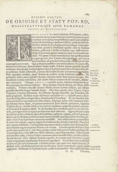
This is a page from Hendrick van Ruse’s "Versterckte Vesting," printed in 1654. The stark contrast of black ink on the off-white paper immediately draws the eye, creating a dramatic visual hierarchy. The composition is dominated by dense blocks of text, framed by the decorative initial capital. This elaborate letter signals the beginning of the text, inviting the reader into its world of military strategy. The language may be unfamiliar, but the overall structure of the page is striking. The title "Den Avteur tot Den Leser" and the body of text tell us this is addressed “From the Author to the Reader,” offering an insight into the mindset of the 17th century. The density and formality of the layout serve to emphasize the seriousness of its content, the art of war. This emphasis on form invites us to reflect on how even the design of a printed page can communicate power and authority.
Comments
No comments
Be the first to comment and join the conversation on the ultimate creative platform.
More like this