1608
Drie Nederlandstalige drempeldichten
Listen to curator's interpretation
Curatorial notes
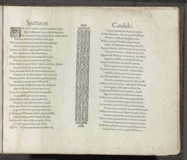
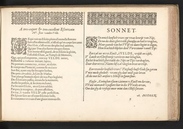
This is an open book, made in the Dutch Republic probably around the turn of the 17th century by Antonius Smyters. It’s a printed book, of course – you can tell that from the crisp regularity of the type. But look closer, and you’ll see it is more than just a book. The pages are dense with poetry in praise of one Jan van den Velde. Now, the crucial thing is that Velde wasn’t a writer, but a master penman. So these poems aren’t just about calligraphy; they’re a kind of advertisement for it. The flourishes and carefully wrought letterforms are all about demonstrating what a skilled hand can do, and enticing you to hire that hand. Think about the world in which this book was made. The rise of capitalism meant that merchants and aristocrats alike needed beautiful handwriting for correspondence and legal documents. Calligraphy was a valuable service, not just an art. It was a trade. The poems printed here honor expertise and offer marketing copy. They are a reminder that even the finest skills can be harnessed to the world of labor and consumption.