Instructie bij het schrijven van de Nederlandse letteren (zesde vervolg) en een kort bericht van de lopende handen 1608
janvandeveldei
Rijksmuseum
drawing, graphic-art, print, textile, paper, typography, ink
drawing
graphic-art
textile
paper
11_renaissance
typography
ink
northern-renaissance
calligraphy
Dimensions: height 260 mm, width 370 mm
Copyright: Rijks Museum: Open Domain
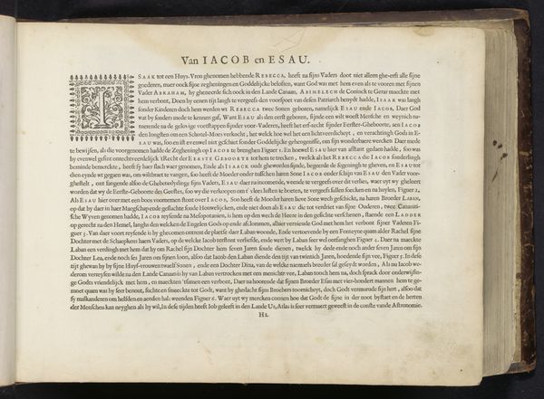
Printed by Jan van de Velde in the early 17th century, this page is an instruction for writing Dutch letters. The page is dominated by the shapes of letters themselves. Notice the elaborate forms, at once familiar and foreign to our eyes. These shapes, these very letterforms, echo a history of script and culture stretching back millennia. Consider how the curves and lines mirror the human body, recalling ancient alphabets that linked letters to the cosmos. Observe the "H," its sturdy vertical lines connected by a horizontal bar—a symbol of stability and connection, reappearing across different writing systems. The act of writing, of forming these letters, is a deeply psychological one. Each stroke carries the weight of tradition, of shared knowledge, and of personal expression. These forms remind us that writing is not merely a tool but a cultural act, shaped by collective memory and individual intent. We are reminded that symbols, such as the letters on this page, are not static but living entities, constantly evolving and adapting to the ever-changing currents of human experience.
Comments
No comments
Be the first to comment and join the conversation on the ultimate creative platform.