drawing, paper, ink
#
portrait
#
script typeface
#
drawing
#
sand serif
#
script typography
#
hand-lettering
#
hand drawn type
#
hand lettering
#
paper
#
ink
#
hand-drawn typeface
#
thick font
#
typography style
#
handwritten font
Copyright: Rijks Museum: Open Domain
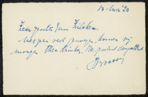
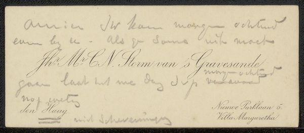
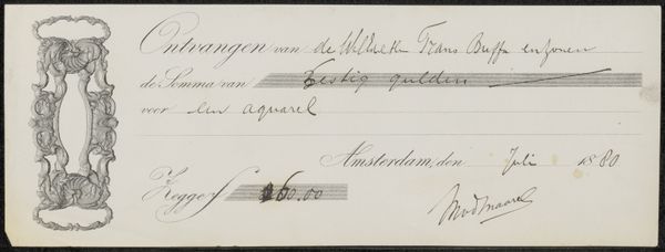
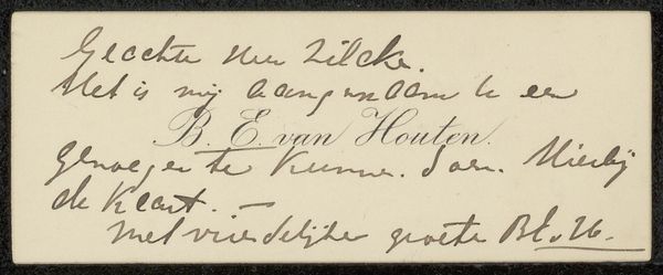
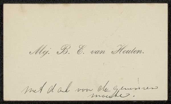
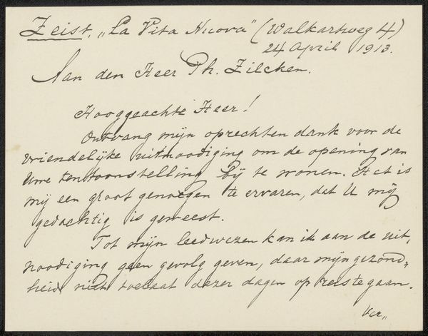
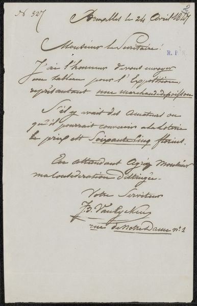
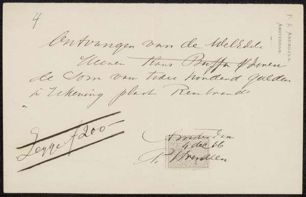
This is a business card to Jan Veth, created by Max Liebermann. It’s all handwriting, elegant, in a dark, almost charcoal-like ink. The letters are so carefully done, with a slight variation in thickness and pressure, it's like a dance across the card. You know, I always find the most seemingly casual marks can sometimes reveal the most about an artist’s thinking. The card itself has a slightly rough texture. Each stroke seems deliberate yet spontaneous, like a carefully choreographed improvisation. Look at the 'M' in Max. It's more than just a letter; it's a little abstract painting. This reminds me of Cy Twombly's scribbles, or even some of Hanne Darboven's systematic writing. There is a sense of time, and layering, even in a single business card, like art is always in conversation.
Comments
No comments
Be the first to comment and join the conversation on the ultimate creative platform.
