Kwatrijnen bij voorstellingen van een blinde koppelaar en een juffrouw 1641
0:00
0:00
crispijnvandeiipasse
Rijksmuseum
graphic-art, print, typography
#
graphic-art
# print
#
typography
Dimensions: height 140 mm, width 190 mm
Copyright: Rijks Museum: Open Domain
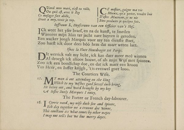
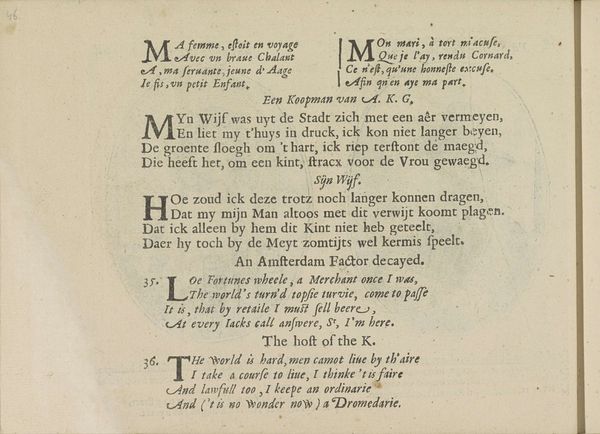
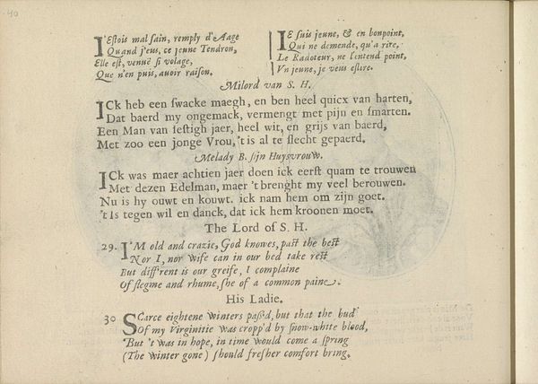
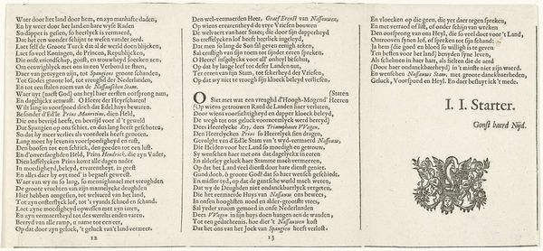
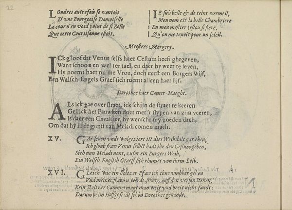
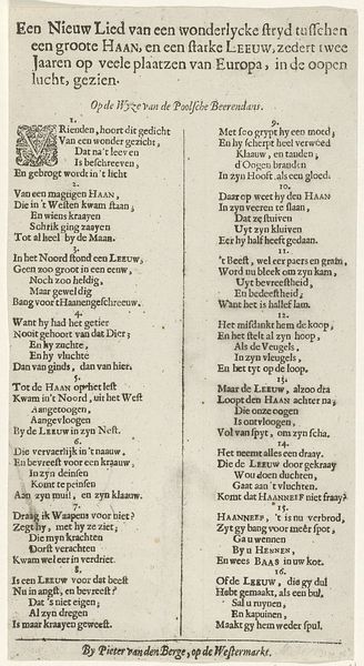
This unbound book from around 1625 was printed by Crispijn van de Passe the Younger, using intaglio. Intaglio printing—think engraving, etching, or drypoint—is a family of techniques in which the image is incised into a surface. Consider the labor involved in the production of this page. The words and image were all painstakingly carved in reverse. Ink was then carefully applied, the excess wiped away, and then pressed onto the paper. Each stage required skill and precision, and this is only one page of a whole book! The material of the book also speaks volumes about the social context of its production. Before the industrial revolution, printing was slow and expensive. Books were luxury objects. The labor and materials that went into making this book reflect the social status of its intended audience: wealthy, literate, and with a taste for finely crafted things. It’s a testament to the power of print, and a reminder that even the most humble materials can carry profound cultural significance.
Comments
No comments
Be the first to comment and join the conversation on the ultimate creative platform.
More like this