graphic-art, print, typography, engraving
#
graphic-art
# print
#
typography
#
engraving
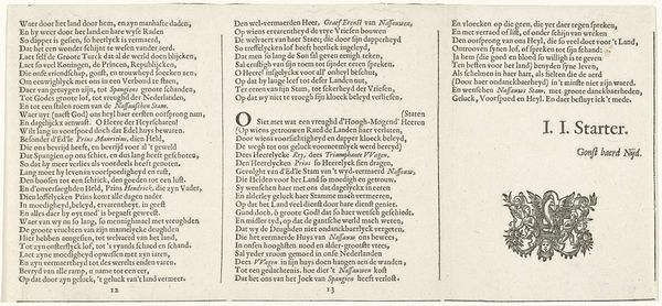
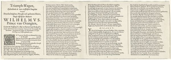
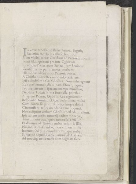
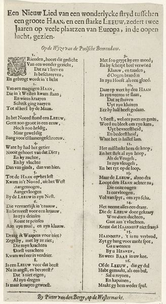
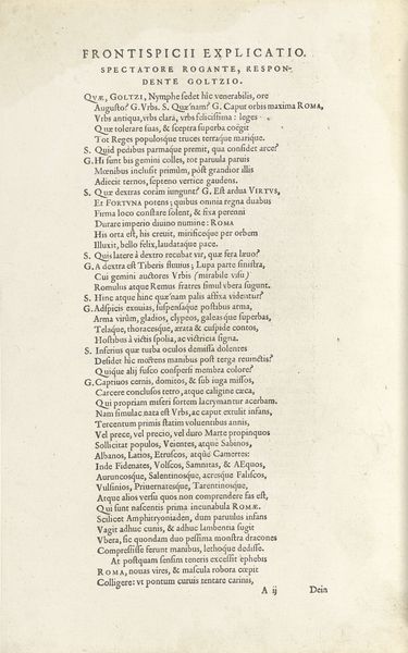
Dimensions: height 140 mm, width 190 mm
Copyright: Rijks Museum: Open Domain
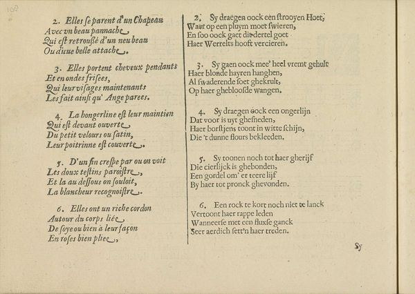
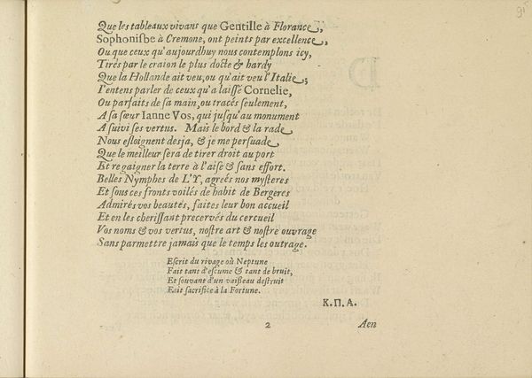
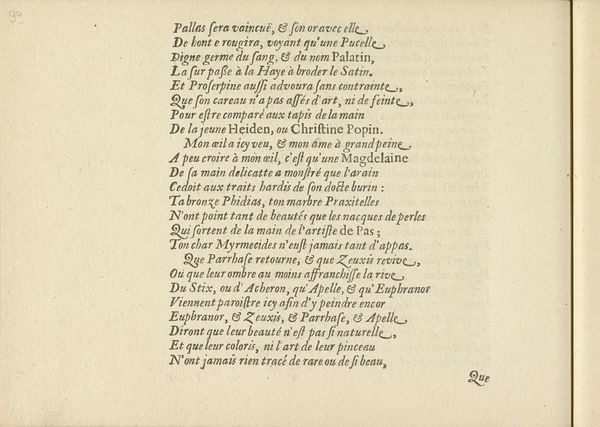
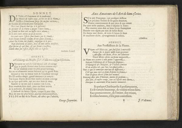
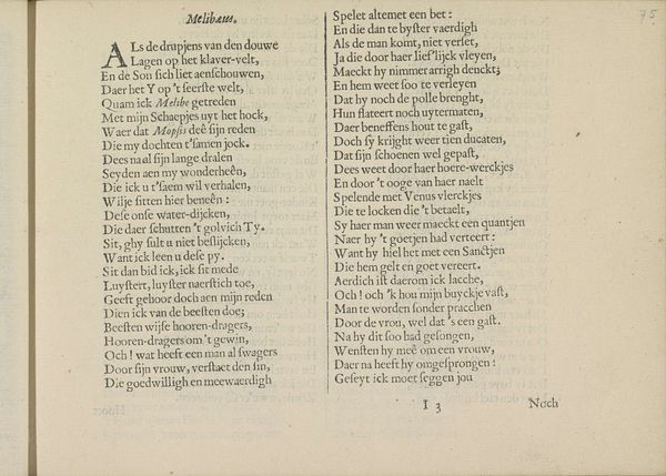
Curator: Here we have "Gezang in twee talen, pagina 3," a 1640 engraving by Crispijn van de Passe II, currently held at the Rijksmuseum. What are your first impressions? Editor: The stark contrast between the ink and paper immediately grabs me. There’s a striking formality, a certain rigidness to the lines of text that is quite captivating. It's almost architectural in its structure. Curator: It's part of a songbook, hence the typography. What is particularly intriguing about this piece is the parallel presentation of text in two languages, French and Dutch. It speaks to a very specific cultural moment of linguistic exchange and the circulation of ideas. Editor: From a purely visual perspective, the symmetry created by the columns of text provides a satisfying balance. But what about the actual content? Does the choice of languages, the pairing of French and Dutch, offer a specific reading? Curator: Absolutely. Consider the social implications. The inclusion of French points to an intended audience of wealthier, more cosmopolitan individuals who would have had the linguistic abilities to navigate both languages. This book aimed at a class that wished to enjoy songs in two prominent languages. Editor: I can see that. The different letterforms themselves seem intentional— the subtle variations, the serifs, and spacing... they guide the eye. The arrangement is almost musical in itself. Curator: Indeed. Also, it's essential to note the themes alluded to. Looking at the poetry, we can see themes of nobility and rural life are set against each other. This was a tumultuous time in the Netherlands, where wealth and political power rested on one side with the aristocrats, and another with wealthy landowners. Editor: So, it's about not just pretty words on paper, but about social dynamics being literally inscribed and visually conveyed. Curator: Precisely. These songbooks tell us how culture was not just performed but consumed and negotiated through material objects like this engraving. It gives us a tangible piece of that world. Editor: A fascinating piece of work. Seeing the work and engaging with its form and materiality brings the 17th-century context into sharper focus. Curator: Agreed. And, through an understanding of history and form, it unveils subtle ways in which art could influence a larger society.
Comments
No comments
Be the first to comment and join the conversation on the ultimate creative platform.
More like this