graphic-art, print, textile, typography
#
graphic-art
#
dutch-golden-age
# print
#
textile
#
typography
Dimensions: height 148 mm, width 320 mm
Copyright: Rijks Museum: Open Domain
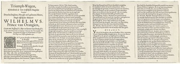
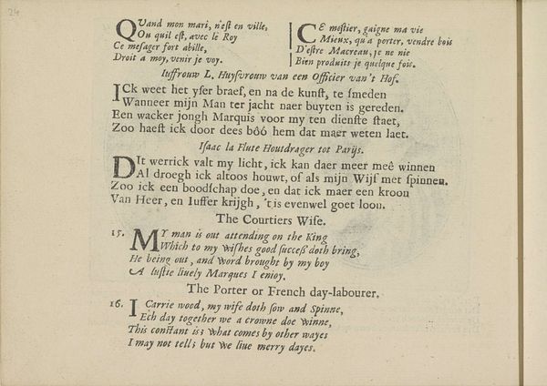
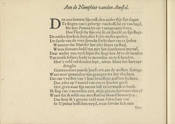
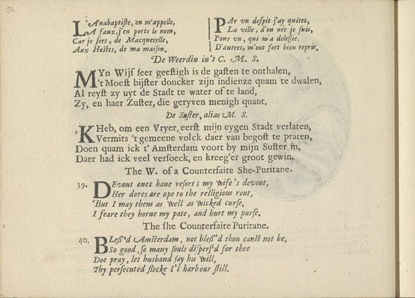
Curator: Here we have "Triumph of William of Orange, text sheet 12-end" by Jan Jansz Starter, created around 1626. It's a fascinating example of graphic art from the Dutch Golden Age, primarily using typography. What strikes you first about it? Editor: I’m intrigued by the text itself, almost like a broadside ballad. It seems really dense and elaborate, almost celebratory. What do you see in it? Curator: For me, the density is the key. It’s so packed with words – declarations, really. Remember, this was a time of great political and social upheaval in the Netherlands, a fight for independence. Editor: So, the text is part of the art itself? Curator: Absolutely. These aren’t just decorative words; they are pronouncements, literally 'pro-claiming' loyalty, pride, and a sense of shared identity. Consider how accessible these prints were meant to be. Editor: And 'accessible' to the literate. What would it have been like to hear this read aloud, maybe in a town square? It must have been incredibly stirring. It is really remarkable. What about the design in the lower-right? Curator: Ah, the small emblem! That provides another key. That's a visual summary, sealing the proclamation, as it were. These details ensured the message resonated on many levels, which brings a question to your mind of that? Editor: I had not looked at it that way! It adds another element for consideration and appreciation. Thanks. Curator: My pleasure. Every piece has stories waiting to be unlocked, doesn't it? Editor: Exactly. I’ll never look at typography the same way again.
Comments
No comments
Be the first to comment and join the conversation on the ultimate creative platform.
More like this