print, textile, typography
#
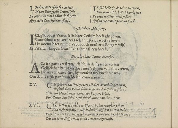
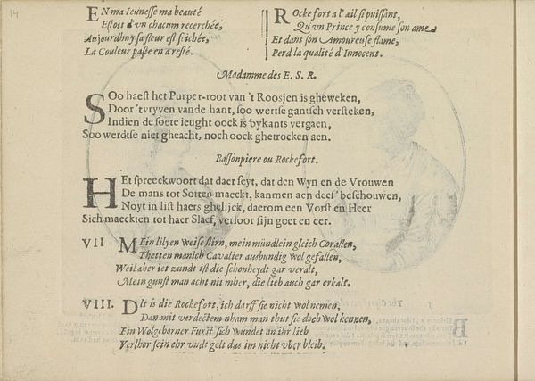
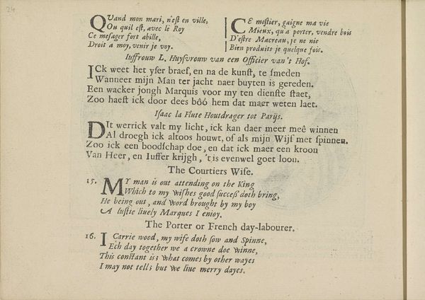
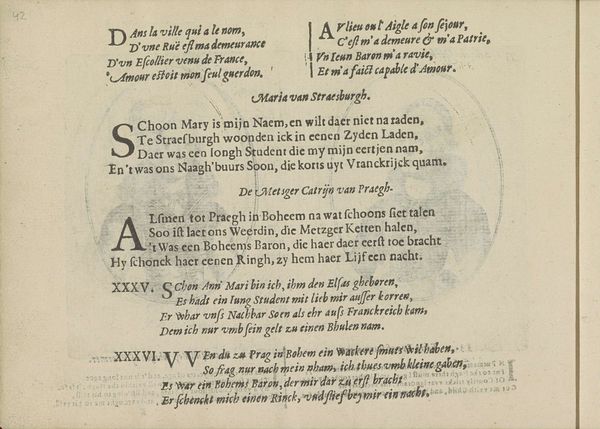
portrait
# print
#
landscape
#
textile
#
typography
#
cityscape
#
academic-art
#
miniature
Dimensions: height 140 mm, width 190 mm
Copyright: Rijks Museum: Open Domain
Curator: Today, we’re looking at a fascinating print called "Kwatrijnen bij voorstellingen van twee mennistenzusjes," or "Quatrains with portraits of two Mennonite sisters.” It was created around 1641 by Crispijn van de Passe the Younger. The artwork resides at the Rijksmuseum, if you'd like to see it in person. Editor: Immediately, the contrast grabs me. It's a rather somber layout but also vibrant. It feels like I am peering into secrets through this visual representation. The heavy use of black ink emphasizes text, and it's quite commanding. Curator: Precisely. This print showcases a series of texts. The quatrains provide insights into religious life, offering commentary on faith and society. Each quatrain seems to explore a different facet of devotion, dissent, and societal critique within the context of Anabaptist beliefs. Consider, for instance, the commentary of female religious figures, filtered through a male dominated discourse. Editor: That's where my mind went as well! Visually, the recurring shapes, like those bold uppercase letters, signal symbolic weight, calling on religious history and emphasizing the characters as figures representing specific spiritual attributes. How do you see those characters relating to our modern understanding of religion? Curator: By understanding the broader historical moment in which they appeared. Crispijn van de Passe’s choice to portray religious subjects during a time of immense social and religious upheaval speaks to an active engagement with then-contemporary issues and highlights the shifting dynamics of the family, domesticity and even governance. Editor: There is definitely an unsettling vibe in the contrast here that is really drawing me in, so different than the more stoic period iconography. I'll admit my view is probably pretty biased by contemporary interpretations and all the baggage that comes with. It can be a burden to understanding true meaning! Curator: It can indeed, and that tension you mention – between then and now – offers valuable insights into how cultural memory evolves. This print, at once, preserves a historical moment and sparks a continuous conversation about our present one. Editor: Absolutely. Thank you for allowing us to dwell a little longer in front of this piece and offer an appreciation for Crispijn van de Passe. Curator: My pleasure. Art invites questions that stretch across centuries and connect us to each other, even now.
Comments
No comments
Be the first to comment and join the conversation on the ultimate creative platform.
More like this