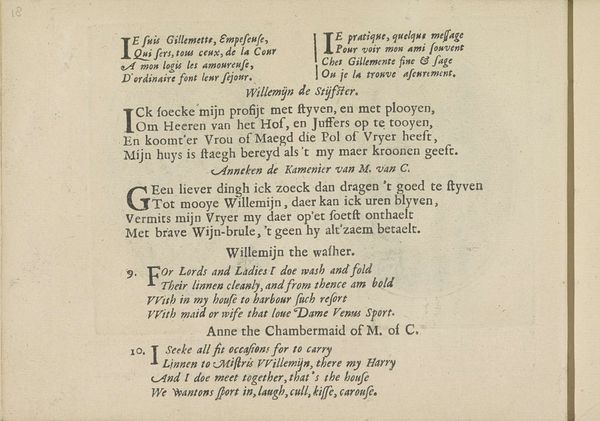
Kwatrijnen bij de portretten van de courtisanes genaamd Schone Ifken van Purmerend en Bes Jans van Wormer 1635
0:00
0:00
crispijnvandeiipasse
Rijksmuseum
graphic-art, print, typography
#
graphic-art
#
dutch-golden-age
# print
#
typography
Dimensions: height 141 mm, width 190 mm
Copyright: Rijks Museum: Open Domain
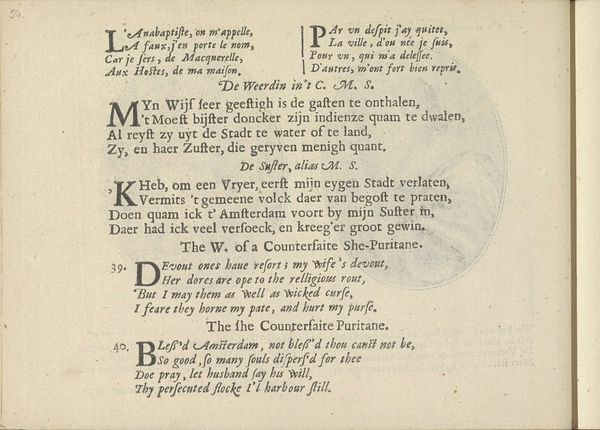
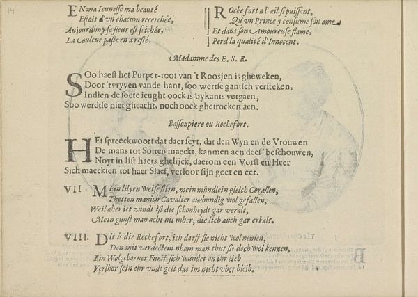
This engraving, made by Crispijn van de Passe the Younger, presents an intriguing combination of text and graphic design. The use of a monochromatic palette—likely black ink on paper—emphasizes the crispness of the lettering and the starkness of the compositional elements. The text is structured within distinct sections, each demarcated by prominent initial letters and enclosed within circular or oval frames. The arrangement of these textual blocks creates a visually rhythmic pattern across the page. The use of varied fonts and sizes further articulates the hierarchy of information. The lines of text appear dense, contributing to a sense of depth. The piece compels us to consider the relationship between language and image. The strategic placement and typographical choices destabilize traditional reading patterns, inviting a more interpretive and engaged mode of perception. The arrangement functions as a cultural artifact reflecting the socio-linguistic landscape of the time, where the presentation of language was as important as its content.
Comments
No comments
Be the first to comment and join the conversation on the ultimate creative platform.
More like this