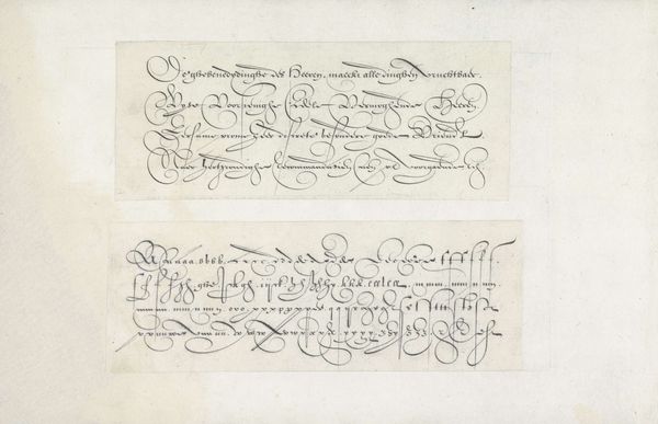
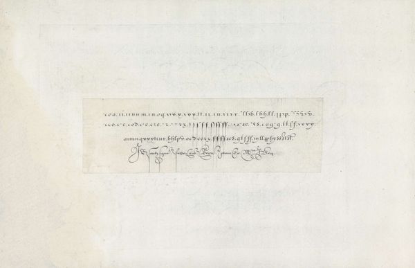
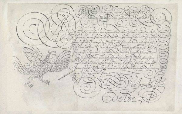
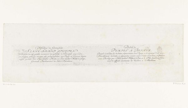
Twee ontwerpen van schrijfvoorbeelden: een Engelse hand en een Hoogduitse lopende letter 1605
0:00
0:00
janvandeveldei
Rijksmuseum
drawing, paper, ink
#
drawing
#
dutch-golden-age
#
paper
#
ink
#
calligraphy
Dimensions: height 64 mm, width 209 mm, height 67 mm, width 209 mm
Copyright: Rijks Museum: Open Domain
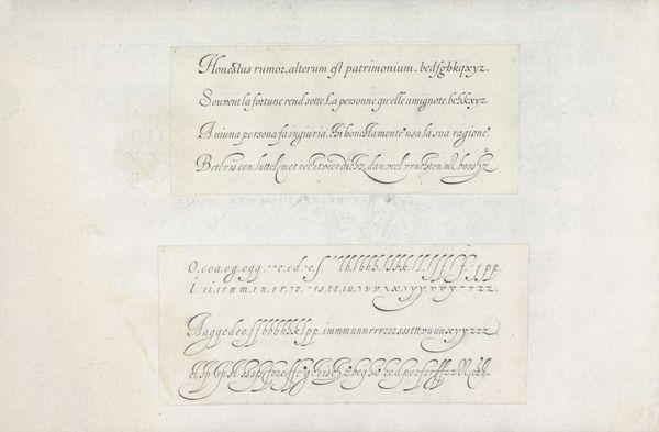
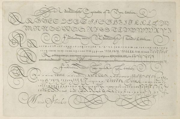
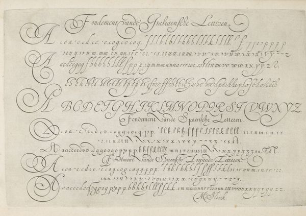
Here we see two writing samples by Jan van de Velde I, dating back to the early 17th century, rendered in ink. Notice the contrast between the English hand above and the High German script below. Each script carries its own set of cultural connotations. The English style, with its flowing curves and flourishes, speaks to a tradition of elegance and refinement. Meanwhile, the German script, more angular and precise, reflects a different sensibility, perhaps one of practicality and order. Throughout history, calligraphy has served as more than just a means of communication; it embodies status, identity, and artistic expression. Think of the illuminated manuscripts of the Middle Ages, where each letter was a work of art, imbued with spiritual significance. Or consider the intricate scripts of the Islamic world, where calligraphy became a sacred art form, used to transcribe the words of the Quran. In each case, handwriting connects us to the ethos of a time. As we gaze upon these scripts, we are reminded of the enduring power of the written word to shape our world.
Comments
No comments
Be the first to comment and join the conversation on the ultimate creative platform.
More like this