drawing, graphic-art, paper, typography, ink
#
drawing
#
graphic-art
#
paper
#
typography
#
ink
#
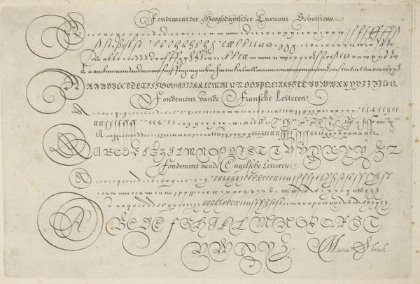
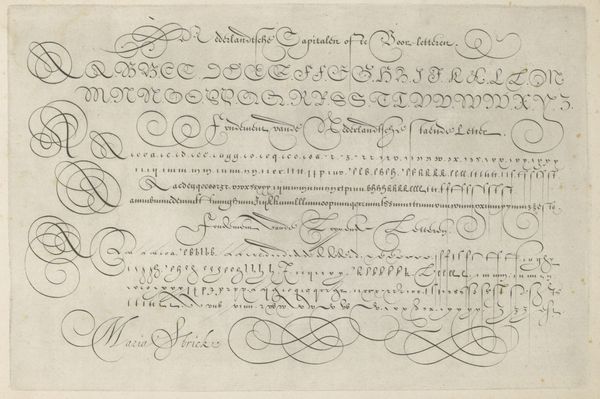
calligraphy
Dimensions: height 74 mm, width 174 mm, height 79 mm, width 184 mm
Copyright: Rijks Museum: Open Domain
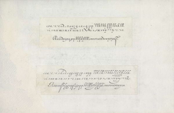
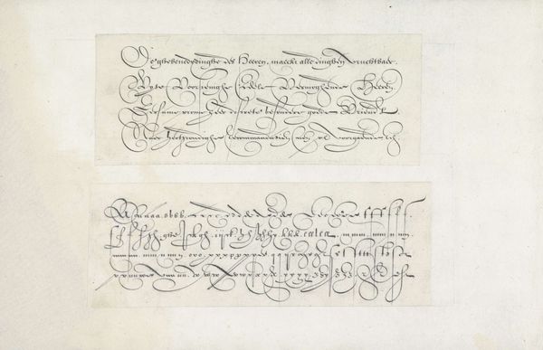
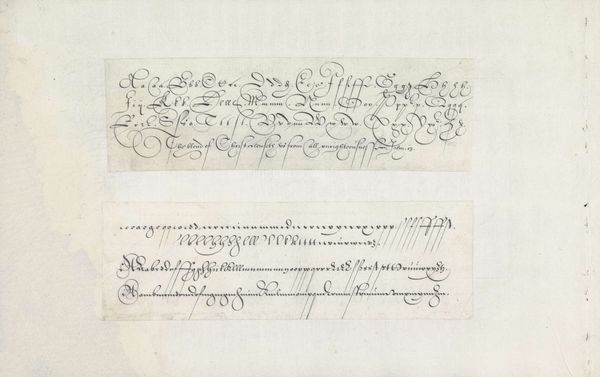
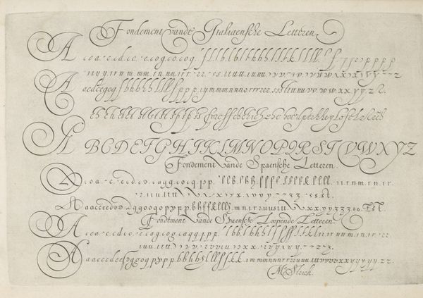
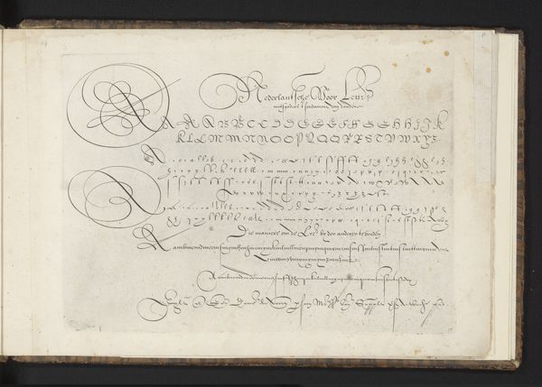
Jan van de Velde I made these two pen and ink designs of writing examples, called 'Twee ontwerpen van schrijfvoorbeelden: de Italiaanse letter', sometime between his birth in 1568 and death in 1623. During this period in the Dutch Republic, calligraphy was more than just a practical skill; it was an art form, a reflection of one's education, and a marker of social status. The Italian script, known for its elegance and readability, was particularly valued and taught in schools, and was a tool for commerce. Van de Velde, through these designs, not only demonstrates the aesthetic possibilities of the script but also subtly reinforces its cultural importance. How do we know this? By looking at the manuals and the social history of education. By examining the types of documents produced using this script, we can better understand its role in shaping social and institutional practices.
Comments
No comments
Be the first to comment and join the conversation on the ultimate creative platform.
More like this