acrylic-paint
#
op-art
#
acrylic-paint
#
abstract
#
geometric pattern
#
abstract pattern
#
geometric
#
geometric-abstraction
#
repetition of pattern
#
abstraction
#
pattern repetition
#
modernism
#
hard-edge-painting
Copyright: Modern Artists: Artvee
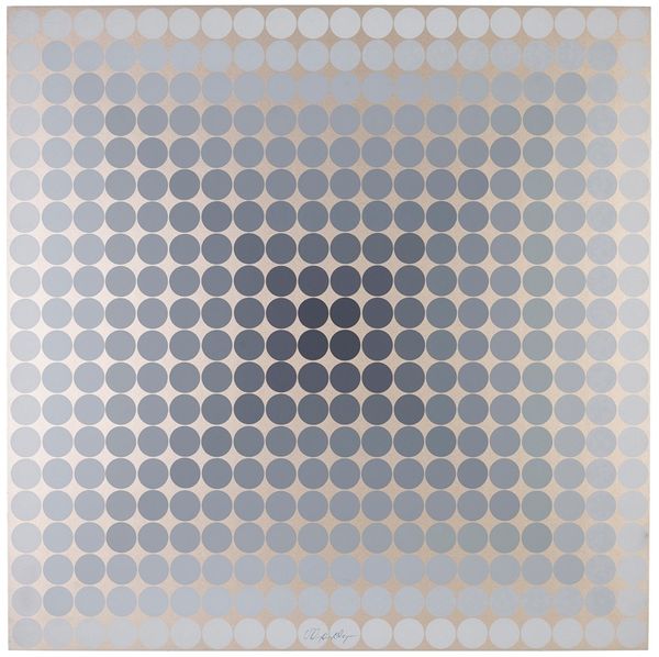
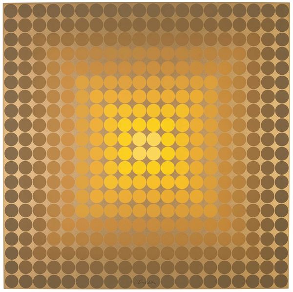
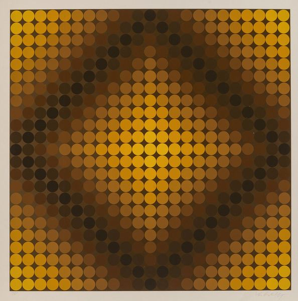
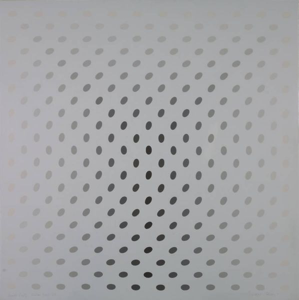
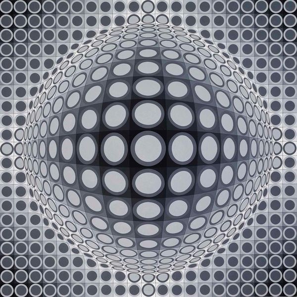
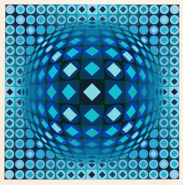
Victor Vasarely made this geometric painting, CTA 102 #5, with cool detachment. Look at how the circles shift in color, arranged to trick the eye and create an illusion of depth, almost like staring into a void. The color choices are interesting, a range of grays that feel very controlled, almost industrial, and the circles are evenly painted, no brushstrokes here. It’s all about the visual effect, the optical play, like a game of perception. I wonder, what did he use to make the circles so perfect? Is it paint? Is it print? Vasarely's work reminds me a bit of Bridget Riley’s Op Art. Both artists are playing with the viewer's perception, making us question what we see, but Vasarely feels more calculated, maybe more in line with the minimalist art being made at the time. Ultimately, though, both artists remind us that art isn’t just about what's on the canvas, it's about how we see it, and how it makes us feel.
Comments
No comments
Be the first to comment and join the conversation on the ultimate creative platform.
More like this