print, public-art, paper, typography, poster
#
type repetition
#
aged paper
#
dutch-golden-age
# print
#
public-art
#
paper
#
social-realism
#
typography
#
poster
#
modernism
#
calligraphy
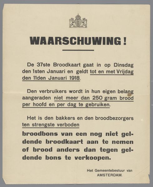
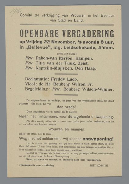
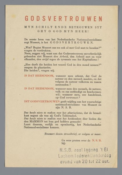
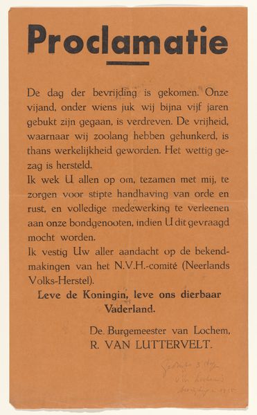
Dimensions: height 42.8 cm, width 35 cm
Copyright: Rijks Museum: Open Domain
This public announcement was printed by the local government in Amsterdam, probably using a printing press, sometime in April 1919. It's a simple poster with a limited colour palette, just shades of orange on a pale background, typical of printmaking. I love the way the text fills the space, each word carefully placed, and how the information is so carefully laid out. It reminds me that art-making, whatever the medium, is always a process of decision making. The bold, sans-serif font feels very direct, and the texture of the paper adds to the sense of immediacy. Even the imperfections—the slight misalignments and variations in ink density—tell a story. See how the ink is slightly smudged in the upper corner? These small details connect us to the physical reality of the printing process. You can see the influence of early 20th-century graphic design in this announcement; I'm thinking of Russian Constructivism. Like those artists, this poster embraces function and clarity over purely aesthetic concerns.
Comments
No comments
Be the first to comment and join the conversation on the ultimate creative platform.
More like this