graphic-art, typography, poster
#
graphic-art
#
type repetition
#
aged paper
#
art-nouveau
#
old engraving style
#
hand drawn type
#
personal sketchbook
#
typography
#
thick font
#
handwritten font
#
golden font
#
poster
#
word imagery
#
columned text
#
calligraphy
Dimensions: height 107 mm, width 134 mm
Copyright: Rijks Museum: Open Domain
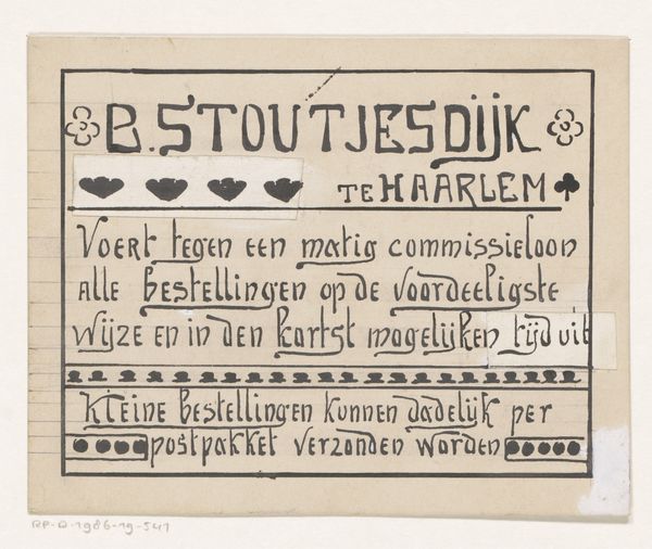
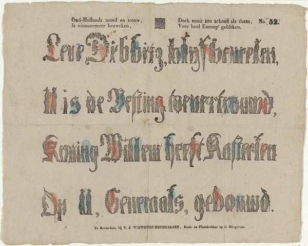
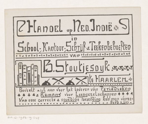
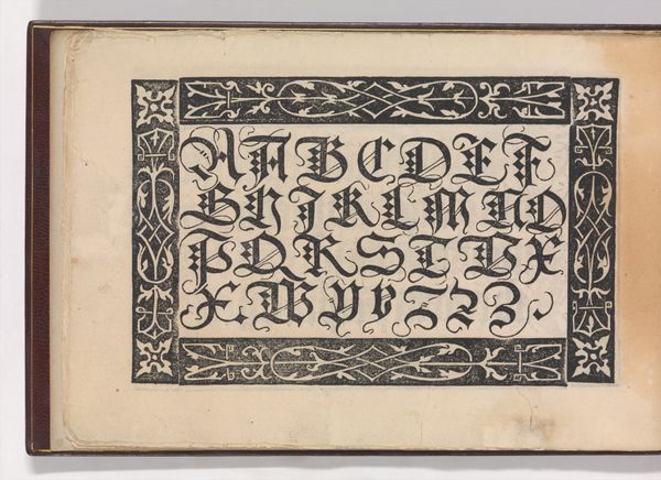
Editor: Here we have Reinier Willem Petrus de Vries's "Ontwerp voor een advertentie van B. Stoutjesdijk," created around 1895. It's a typographical work, quite intricate. The handmade lettering gives it a unique, almost whimsical quality, don't you think? What aspects of the design catch your eye? Curator: It's interesting how the artist uses varying line weights and letterforms. Note how the heavy, blocky font of "B. STOUTJESDIJK" contrasts with the more flowing script used for the rest of the text. Consider the semiotic implications; what message might the artist be conveying through this contrast? Editor: Perhaps emphasizing the brand name while keeping the promotional information elegant and inviting? The spacing, or lack thereof, feels very deliberate as well. It almost feels like the text is an object, densely packed and carefully arranged. Curator: Precisely. Look at how the negative space interacts with the positive forms of the letters. There's a visual rhythm created by the repetition of shapes and the varying density of the text. Consider also how the flourishes and decorative elements contribute to the overall compositional structure. What would you say the "aged paper" communicates about the brand itself? Editor: The weathered texture and warm hue lend the piece an aura of authenticity and longevity, which could subtly enhance the product’s appeal to its target market, couldn’t it? The typeface used has a classic and authoritative feel. Curator: It also creates an interesting tension between modern advertising and more traditional craft. I learned from your analysis of spacing as structure within the composition, moving from sign to structure. Editor: And I appreciated how you brought up that interplay between different forms of typography. Now I am more conscious of how this creates a visual hierarchy and draws the eye through the composition.
Comments
No comments
Be the first to comment and join the conversation on the ultimate creative platform.
More like this