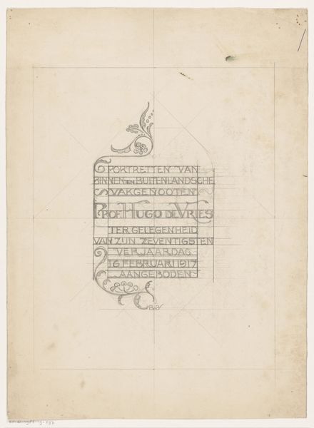
drawing, graphic-art, paper, typography, ink
#
drawing
#
graphic-art
#
art-nouveau
#
pen drawing
#
paper
#
typography
#
ink
Dimensions: height 302 mm, width 225 mm
Copyright: Rijks Museum: Open Domain
Curator: This drawing by Carel Adolph Lion Cachet is an ornamental page from around 1899, titled "Inleiding met ornamentrand voor Onder Neerlands vlag." The design consists of text framed by decorative, stylized plant motifs, executed in ink on paper. The work, now at the Rijksmuseum, shows characteristics of the Art Nouveau movement. What's your immediate take? Editor: Well, the immediate feeling is somber, almost militant. The sharp contrast of the black ink against the white paper lends a sense of austerity, which aligns somewhat with the bold typography. Curator: Yes, that’s an astute observation about the formal elements. Look closely at how the typeface and floral patterns contribute to the artwork’s overall structure. The strong verticality and the rhythmic repetition of the design elements suggest a structured visual system, almost like a grid. The letterforms themselves feature unique attributes rooted in early-20th-century design. Editor: The context here is unavoidable though. Considering this was created at the turn of the century in Europe, a period of intense nationalism, doesn't the title "Under Netherlands Flag" together with this kind of severe presentation feel like a visual representation of Dutch militarism or colonial ambitions? The typography even carries a slight martial tone. It reads as nationalistic propaganda cloaked in Art Nouveau aesthetics. Curator: I agree that it evokes powerful historical and social connotations, although this work’s emphasis on formal qualities might point away from overly blatant ideological aims. But that tension itself is precisely what's fascinating. The interplay between these organic, stylized shapes and the regimented text creates a striking duality, a push-and-pull effect where the decorative elements attempt to soften the inherent rigidness of the printed word, though ultimately failing. Editor: Ultimately failing, I agree. Still, consider how it functions as a historical object: who was this created for? How did its intended audience interpret these symbols of the Dutch flag in relation to their experiences? Those questions lead toward richer narratives of identity and power dynamics. It provides insight into the visual strategies through which national pride and perhaps even cultural dominance were communicated at the time. Curator: A well-taken point. Examining the work through an ideological lens indeed opens exciting avenues of interpretation. What strikes me as relevant, from a purely formal point of view, is the use of this graphic art aesthetic and format to give prominence and embellishment to words; indeed the word becomes art, which is very much the focus here. Editor: I think considering both these frameworks reveals an enduring testament to art's capability of embodying complex ideas—or perhaps even serving a social or political cause!
Comments
No comments
Be the first to comment and join the conversation on the ultimate creative platform.
More like this