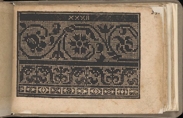
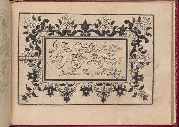
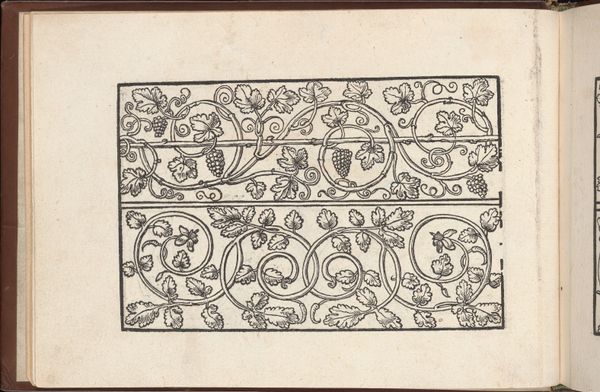
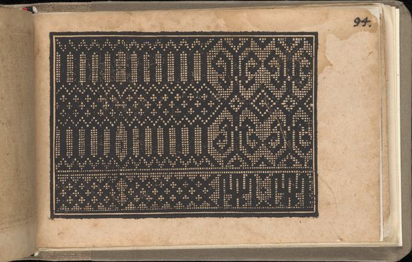
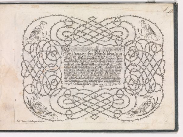
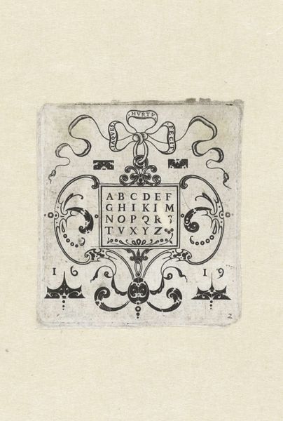
Libellus Valde Doctus Elegans, et Utilis, Multa et Varia Scribendarum (Elegant and Useful Book on the Learned Art of Writing) 1549
0:00
0:00
drawing, print, typography
#
drawing
#
medieval
# print
#
typography
#
calligraphy
Dimensions: Overall: 6 5/16 x 9 7/16 x 11/16 in. (16 x 24 x 1.7 cm)
Copyright: Public Domain
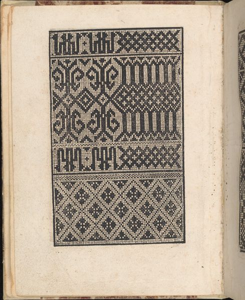
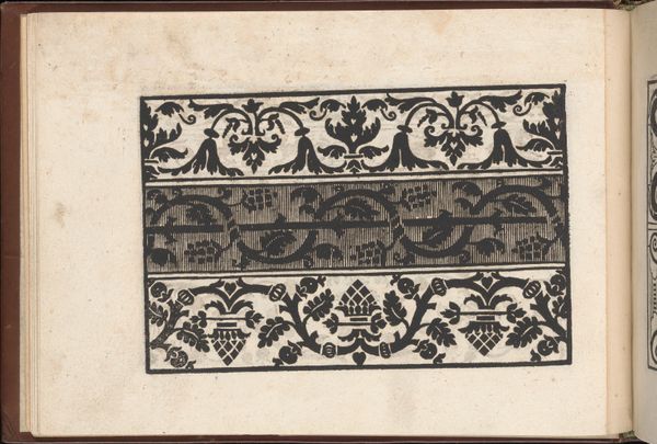
Editor: We're looking at "Libellus Valde Doctus Elegans, et Utilis, Multa et Varia Scribendarum", or "Elegant and Useful Book on the Learned Art of Writing" by Urban Wyss, dating back to 1549. It's a drawing and print that features typography and calligraphy. It's part of the collection at the Met. I find the intricacy of the letterforms and the decorative border so captivating. What do you see in this piece from a formal perspective? Curator: I’m immediately drawn to the balance achieved within the confined space. Observe how the density of the black ink in the letterforms is mirrored and offset by the meticulously rendered decorative border. The negative space, the pale surface of the page, acts as a crucial element, defining the shapes and contributing to the overall harmony. Editor: The black and white contrast is very striking! Is there a particular letter or aspect of the design that you find most compelling from a structural viewpoint? Curator: The "Q" in the upper left is quite interesting, and it sets the tone for the alphabet, what follows are complex yet orderly figures. This careful composition extends beyond individual letterforms; it encompasses the entire page, establishing visual rhythm and balance, a testament to Wyss’s sophisticated understanding of form. Are you noticing that these intricate shapes offer a complex network to investigate? Editor: Yes, I am! I guess I hadn't really noticed the ways the individual characters work together as components within the larger design! Curator: Precisely. Formal analysis allows us to appreciate the sheer mastery of line, form, and composition, irrespective of its historical context. And to truly consider how each mark affects the overall design and, more fundamentally, engages our attention. Editor: It's interesting to view something seemingly functional like typography and appreciate it for its aesthetic form. Thank you for elucidating those elements.
Comments
No comments
Be the first to comment and join the conversation on the ultimate creative platform.
More like this