drawing, graphic-art, paper, typography, pencil
#
drawing
#
graphic-art
#
toned paper
#
hand-lettering
#
ink paper printed
#
hand drawn type
#
hand lettering
#
paper
#
personal sketchbook
#
typography
#
hand-drawn typeface
#
fading type
#
geometric
#
pencil
#
sketchbook drawing
#
sketchbook art
#
calligraphy
Copyright: Rijks Museum: Open Domain
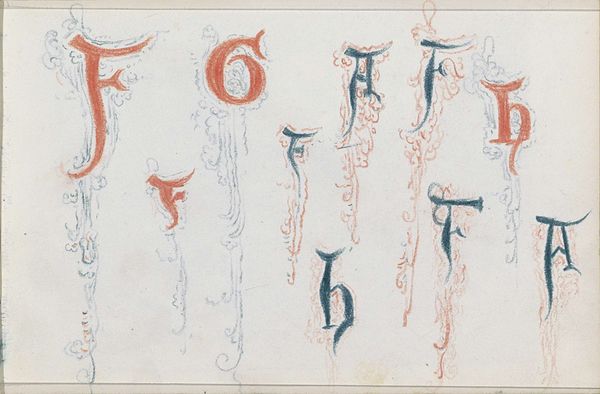
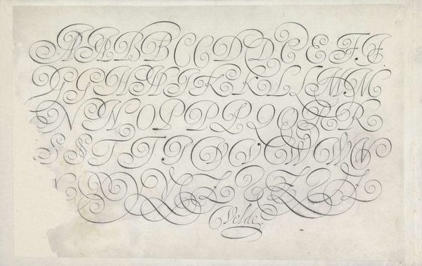
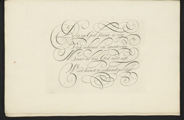
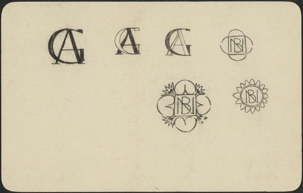
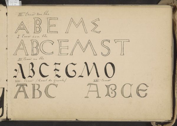
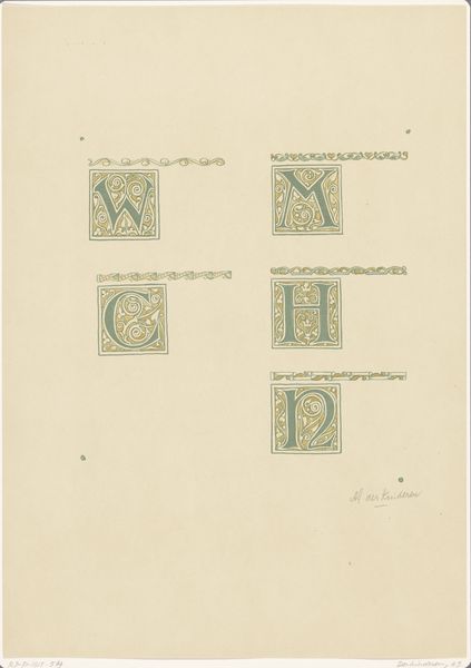
Editor: This is “Sierletters,” a drawing and graphic art piece made with pencil, ink, and paper, dating back to 1860 or 1861, by Isaac Gosschalk. I am drawn to the variety of lettering, but also the delicate lines that adorn some of the characters. How would you interpret this work? Curator: The most compelling aspect of this piece is the emphasis on form. Observe how the artist experiments with different stylistic interpretations of the alphabet, transforming the utilitarian function of letters into pure visual exploration. Notice the contrast between the bold, almost block-like “A” and the fluid, cursive quality of other iterations of letters within this composition. Editor: So, you are less interested in what the letters *mean*, and more in how they look? Curator: Precisely. It’s fascinating to consider the interplay between the precision of some letterforms and the almost improvisational feel of others. Consider the use of color - red, blue, and green. Do you find that they complement each other effectively? Editor: They do create some visual hierarchy, distinguishing some letters, particularly larger versions, over the fainter characters. It does create a certain energy that I missed at first glance. Curator: Indeed. Furthermore, note the tonal variations achieved through the layering of pencil and ink. This lends depth to the image, pushing it beyond a mere study of typography and closer to a dynamic artistic composition. Editor: That's given me a fresh viewpoint on the artist's decisions regarding line, color, and space within the frame, moving past the idea of merely writing. Curator: I'm glad. It highlights how formal analysis reveals an intention beyond mere representation or communication of basic lettering, and focuses our attention on composition, technique and artistic expression.
Comments
No comments
Be the first to comment and join the conversation on the ultimate creative platform.
More like this