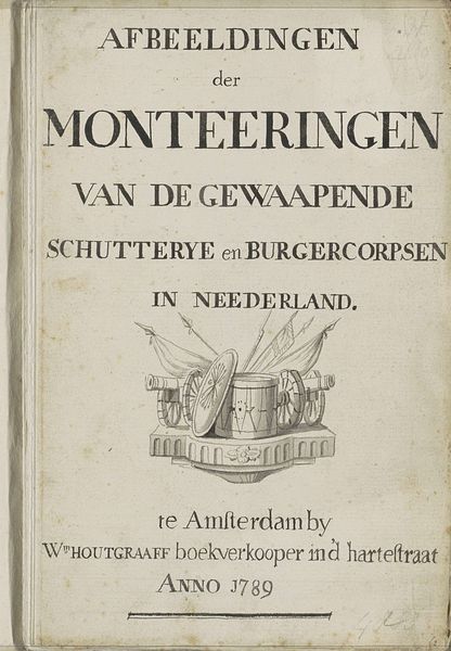
print, engraving
baroque
landscape
line
watercolour illustration
genre-painting
history-painting
engraving
Dimensions: height 100 mm, width 145 mm
Copyright: Rijks Museum: Open Domain
Editor: Here we have a print titled "Jagers en cartouche" by an anonymous artist, created after 1666. It’s an engraving with some lovely watercolour illustration. It looks like a decorative map or title page. I’m immediately drawn to the symmetry of the composition, but the combination of the cherubic hunters with the angular lines of the map feels quite unique. What do you see in this piece? Curator: Intriguing observation. What captures my attention is the framing device itself. Note the robust cartouche, laden with flourishes, juxtaposed against the implied grid of the map. Consider the duality present: the rigid structure of cartography versus the organic vitality of the figures and flora. Editor: You're right, the cartouche is so ornate against the simple background! The cherubs and the hunter almost seem to break the frame with their weapons pointing out. What do you make of that choice? Curator: The tension between containment and release is quite potent here. The artist employs the frame to both define and defy boundaries. Note how the figures' dynamism is accentuated by their near escape from the ornamental structure. One could interpret this as a comment on exploration, perhaps, a spirit yearning for expansion despite imposed limits. Do you perceive a symbolic language at play in the selected motifs? Editor: Perhaps the weapons represent the power and also danger that comes with exploring new territory. The cherubs soften that idea somewhat… or maybe highlight that innocence is lost when pursuing colonial ambition? Curator: Indeed! And let us not forget the materiality of the piece – engraving, line work, the calculated application of watercolor – all serving to heighten this interplay of discipline and expressiveness. I think we can also analyze the colour composition with an emphasis on the golden highlights. Notice that all ornaments, especially those nearest the words are given gold accents. This stylistic choice would seem to show a great respect for cartography and the impact on civilisation that new land will have. Editor: That's given me so much to think about regarding the layers of intent present in the artwork. It really makes you see this print as something far more complex than simply a decorative map. Curator: Precisely. By engaging with the intrinsic elements of the work, its lines, colors, and forms, we can uncover hidden meanings and appreciate its enduring impact.
Comments
No comments
Be the first to comment and join the conversation on the ultimate creative platform.
More like this